All work

Case study · Fintech · Client project

B2B pay-later app

A supplier-invoice credit product for Australian small businesses, taken from an as-built PRD to 110+ dev-ready screens: a compliance-led onboarding flow, a back office that mirrors it, and a design system from scratch.

Role
Sole designer: flows, UX/UI, design system, brand assets, back office
Timeline
Jul – Aug 2026, evenings and weekends
Team
One developer and the client. I was the only designer.
Scope
Mobile app and web back office
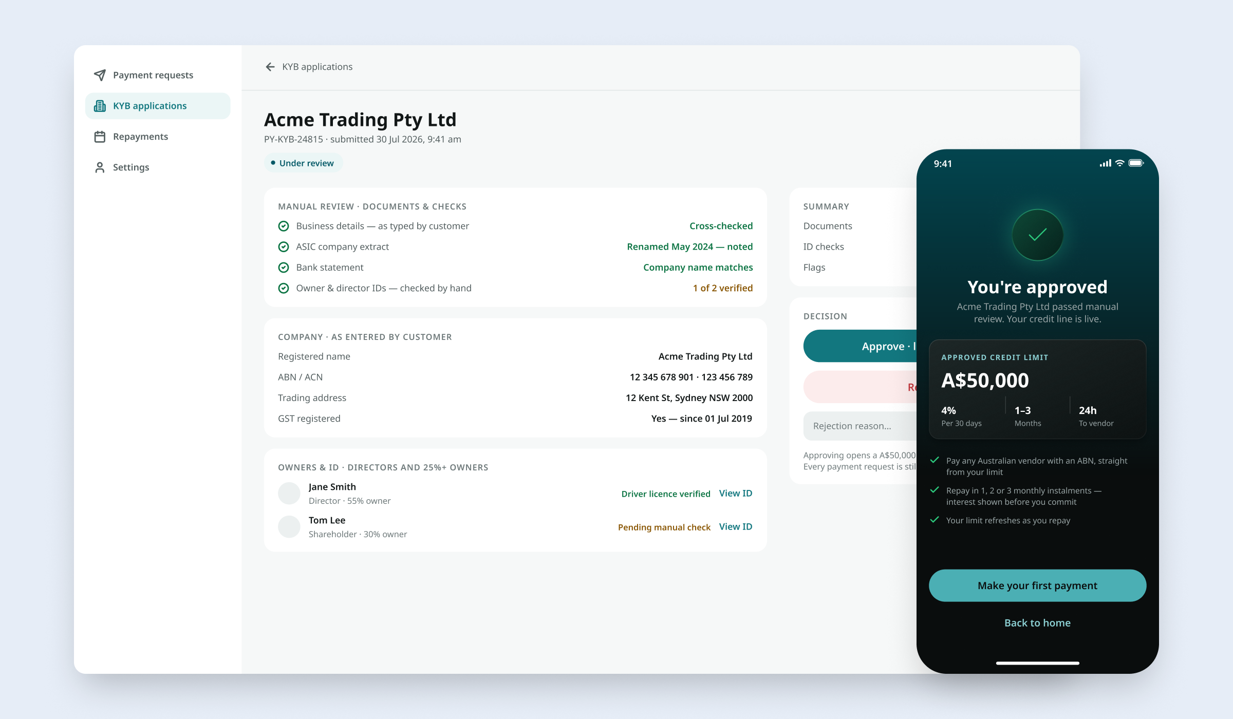
The back-office review of a business application, with the applicant’s phone in front showing “You’re approved” and the credit limit
The reviewer’s side of an application, and the applicant’s phone the moment it’s approved.

Background

The product pays a business’s supplier invoice up front; the business repays in instalments. Before anyone can borrow, the lender has to know exactly who it is lending to. That check is called KYB (know your business), and it is where compliance and drop-off pull in opposite directions.

What I did

The client set out what the product had to do; I designed it, and one developer built it. There were no users to interview yet, so discovery was desk research: AUSTRAC guidance, the ABR and ASIC registers, how comparable products onboard a business, and a line-by-line read of the PRD.

01 · Compliance-led KYB

How much you own decides how much we ask

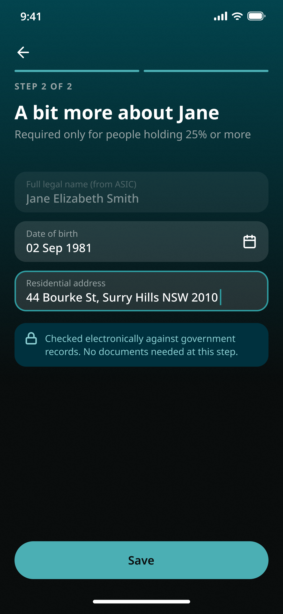
The first KYB flow followed the regulations to the letter and ran to six steps. Reading what the rules actually require of a lender cut it to two: company details come from the registers, and only people who own 25% or more are asked for a date of birth and a home address. With few users at this stage, and to keep development efficient, the product uses manual review for now; 03 covers how.
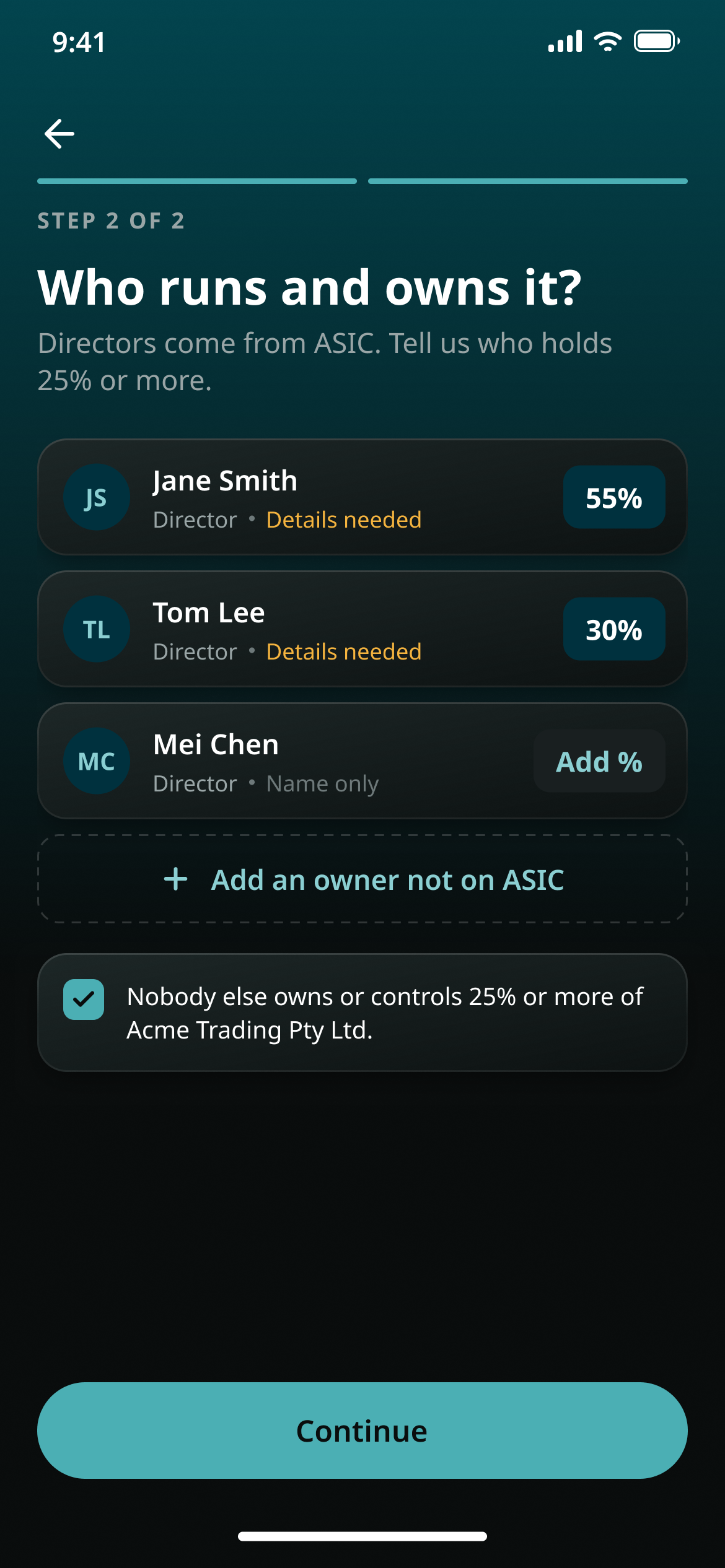
Who runs and owns it: directors pulled from ASIC, each with an ownership percentage, on one screen
Who runs and owns it: one screen instead of three.
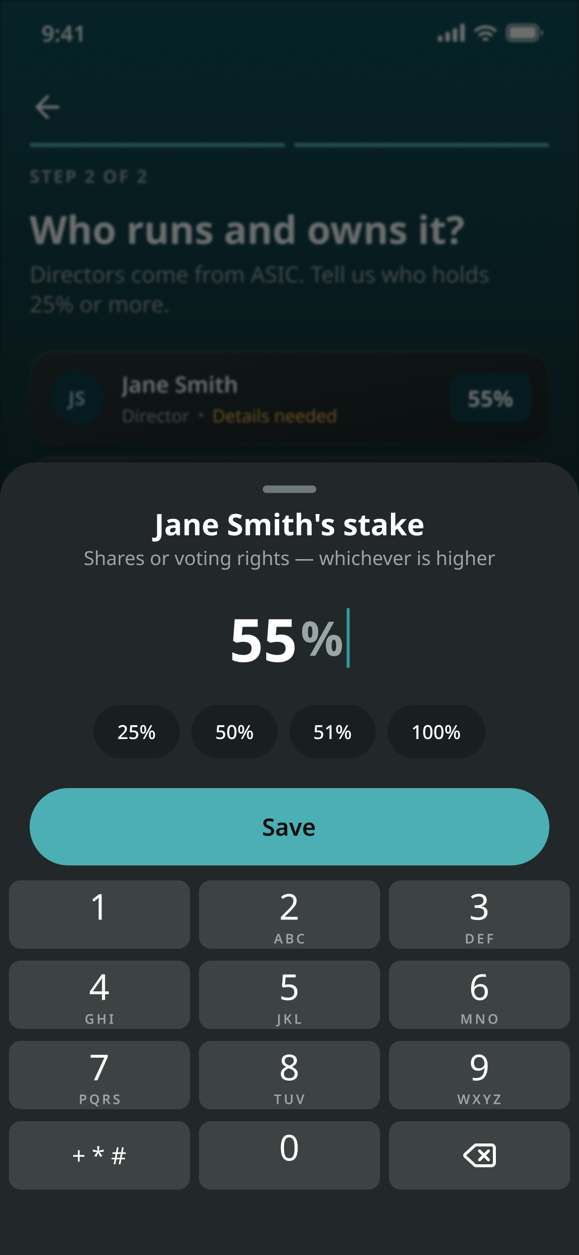
A bottom sheet asking for one person’s stake, with 25%, 50%, 51% and 100% shortcuts
Ownership percentage is the switch.
A bit more about Jane: date of birth and home address, required only for people holding 25% or more
More is asked only of 25%+ owners.

Steps

Six steps in the first version. Two in the registry-backed flow.

The manual-review flow that launches first (03) has three.

02 · ABN check

One lookup, two outcomes

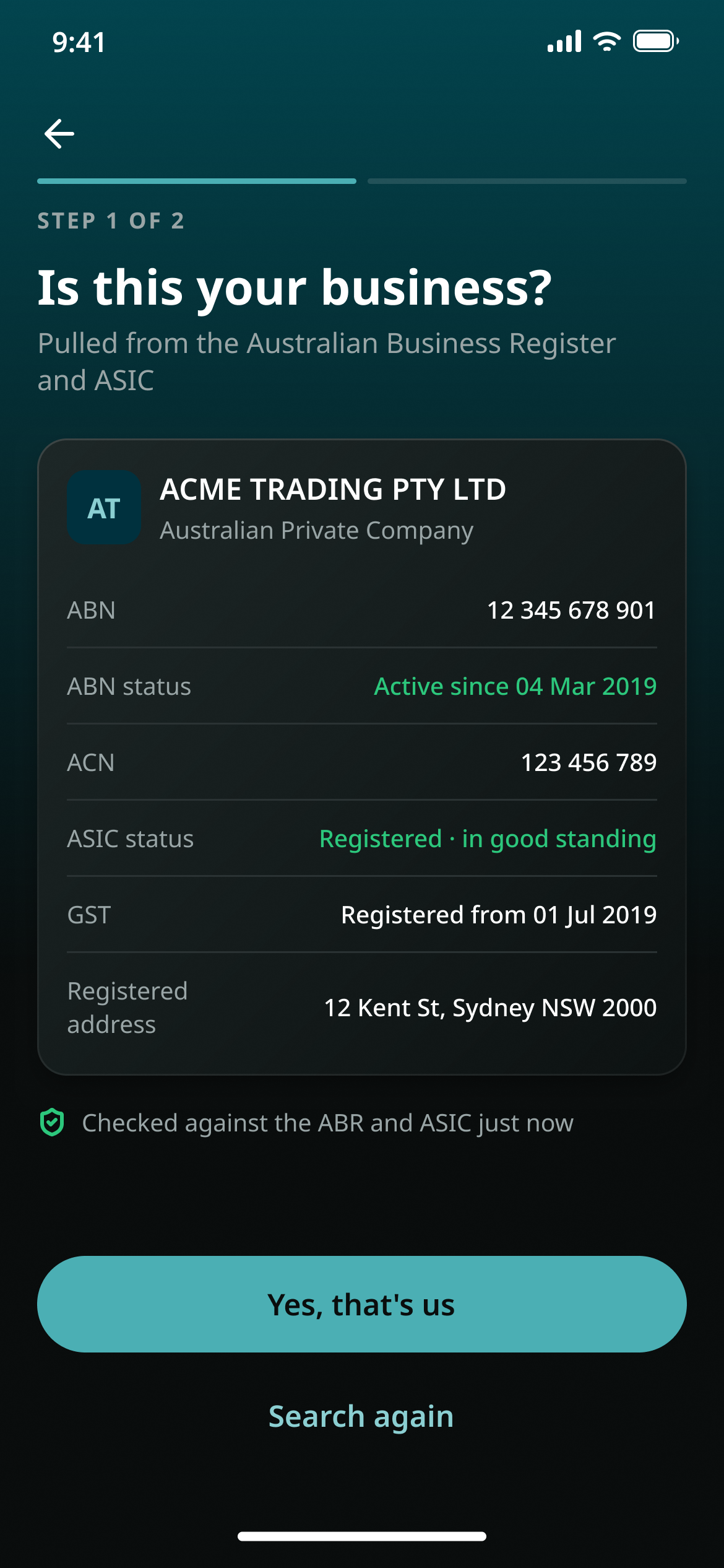
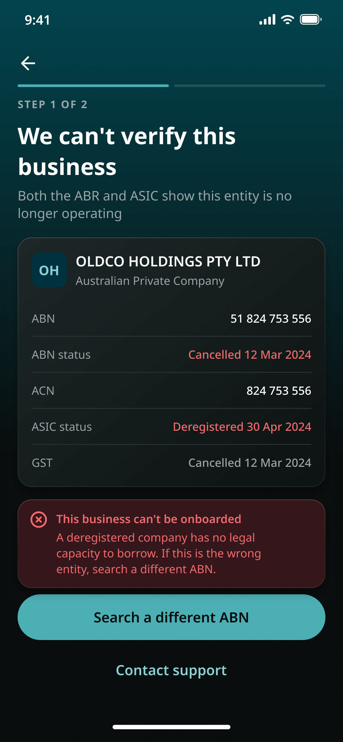
The ABN lookup decides whether the flow can go on. When the registers return a live company, the confirmation screen shows what came back, read-only, and asks one thing: is this your business? When they show the company is no longer operating, the flow stops right there and says why in plain words, instead of letting someone fill in another five screens for nothing.

Is this your business? The company card lists the ABN status and the ASIC status side by side
A verified ABN: what the registers returned.
We can’t verify this business: both registers show the company is no longer operating, and the flow stops with an explanation
An ABN that can’t be verified: the flow stops here.

The copy

“A deregistered company has no legal capacity to borrow.”

The screen says why, not just no.

03 · Phased delivery

Manual first, automatic next

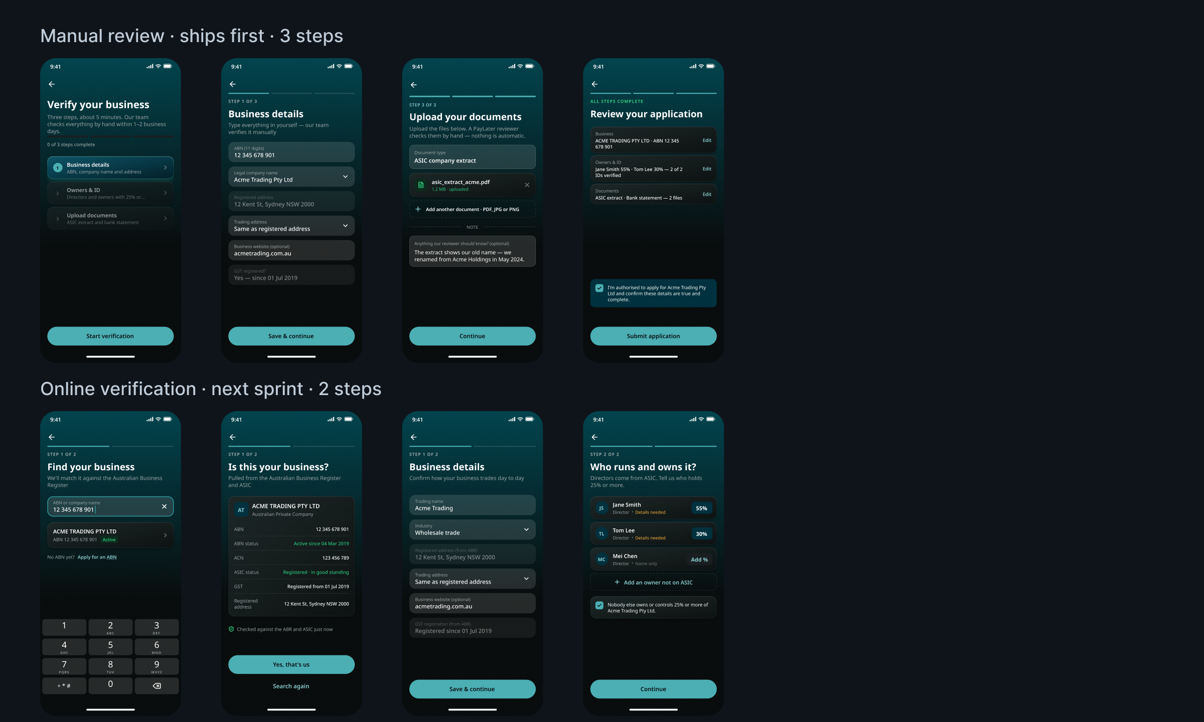
The first version was the ideal flow: everything verified online against the registers. Walking through it with the developer, I proposed splitting it. A manual-review flow ships first: the applicant enters the details and uploads documents, and a person checks them within a couple of working days. The registry-backed flow follows in the next sprint. It was easier to build, easier for reviewers to run, and it gets the business lending sooner.

The overview screen and its structure stay the same across both flows, so neither applicants nor the developer have to relearn anything when the second one lands. The app is honest about it too: this step is “done by a person, not a system”.

Two rows of phone screens: the three-step manual-review flow above, the two-step online-verification flow below
Manual review (three steps, launch) above; online verification (two steps, next sprint) below.

04 · Back office

The back office is the application, mirrored

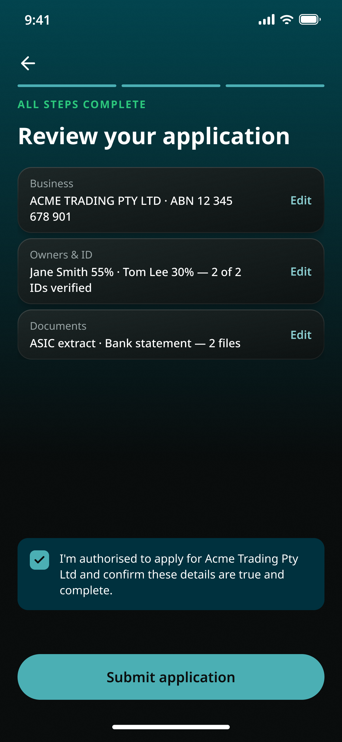
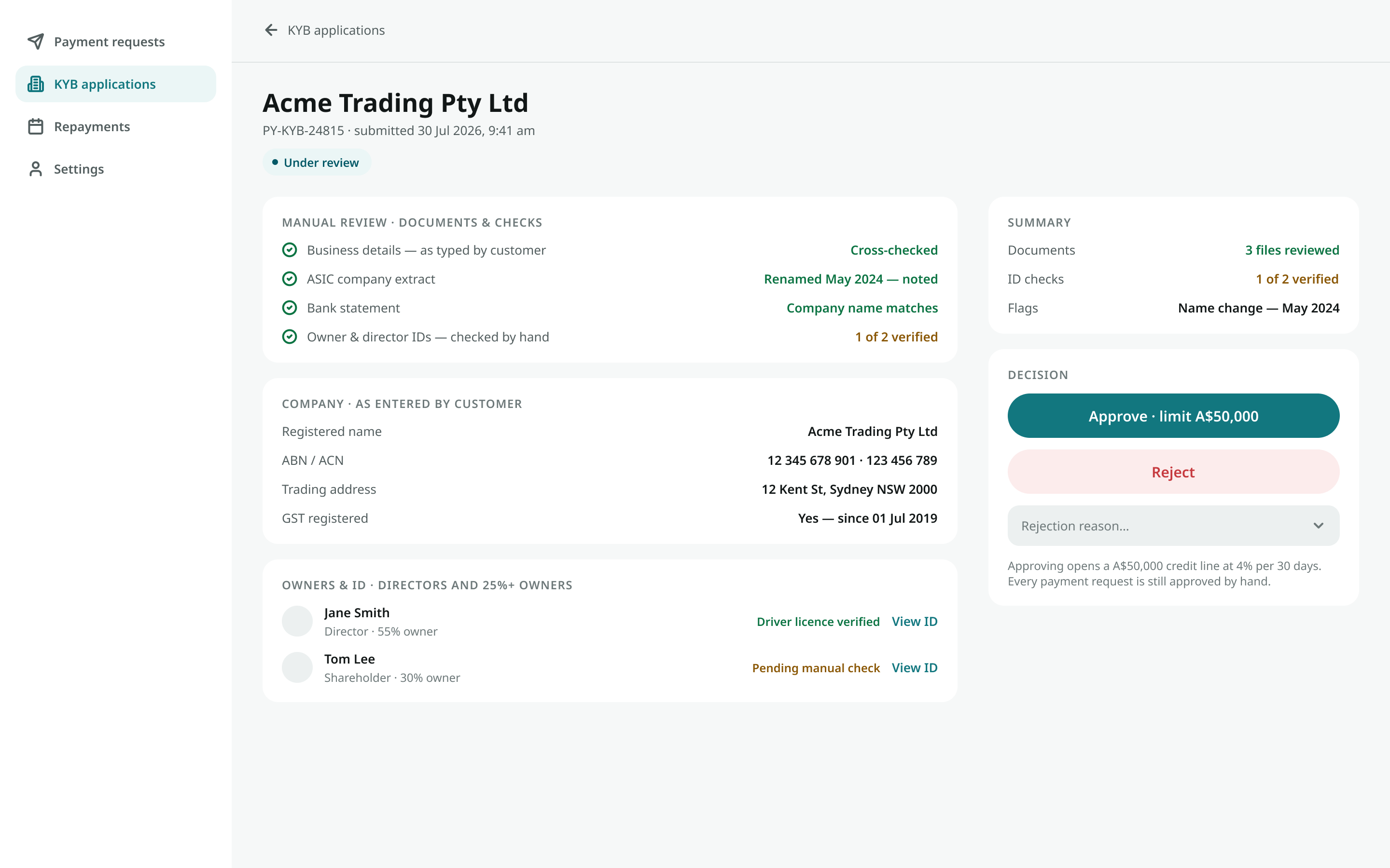
Reviewers see what the applicant entered, the files they uploaded and a checklist to work through, with flags raised for them. A note the applicant leaves at upload (“the company changed its name in May 2024”) shows up on the reviewer’s side as a flag. Approve with a limit, or reject with a reason.

Review your application: business, owners and documents summarised before submitting
What the applicant submits.
The back-office review page: the same sections the applicant filled in, plus a checklist, flags and the approve / reject decision
What the reviewer sees: the same structure, plus checks and flags.

05 · Product thinking

Reading the PRD like a product person

Before designing, I read the PRD for places where the product would contradict itself. The app let people choose a repayment term while the back end fixed a different number of instalments, so the simulated schedule and the real one could never match: a complaint waiting to happen. Late fees had no cap, and nothing reminded anyone that a payment was due.

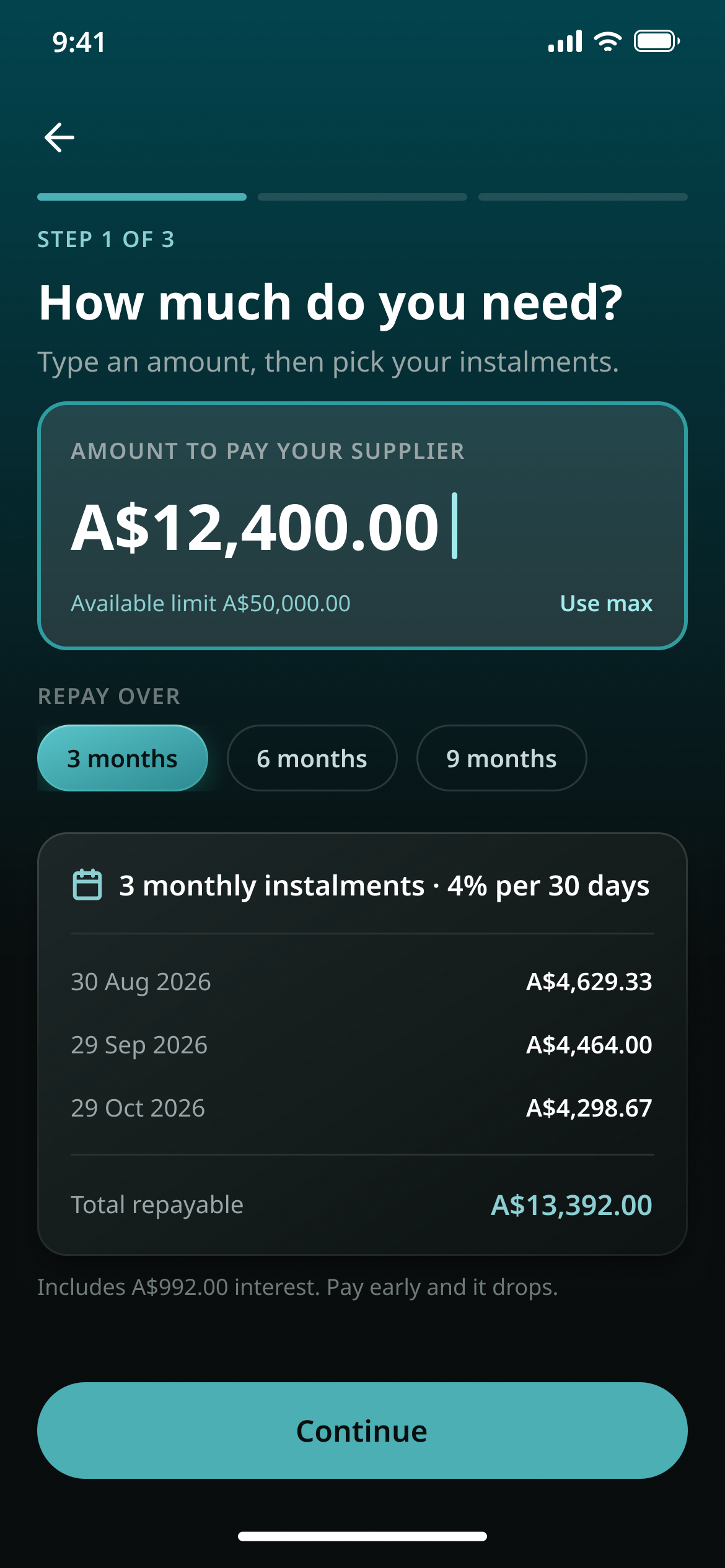
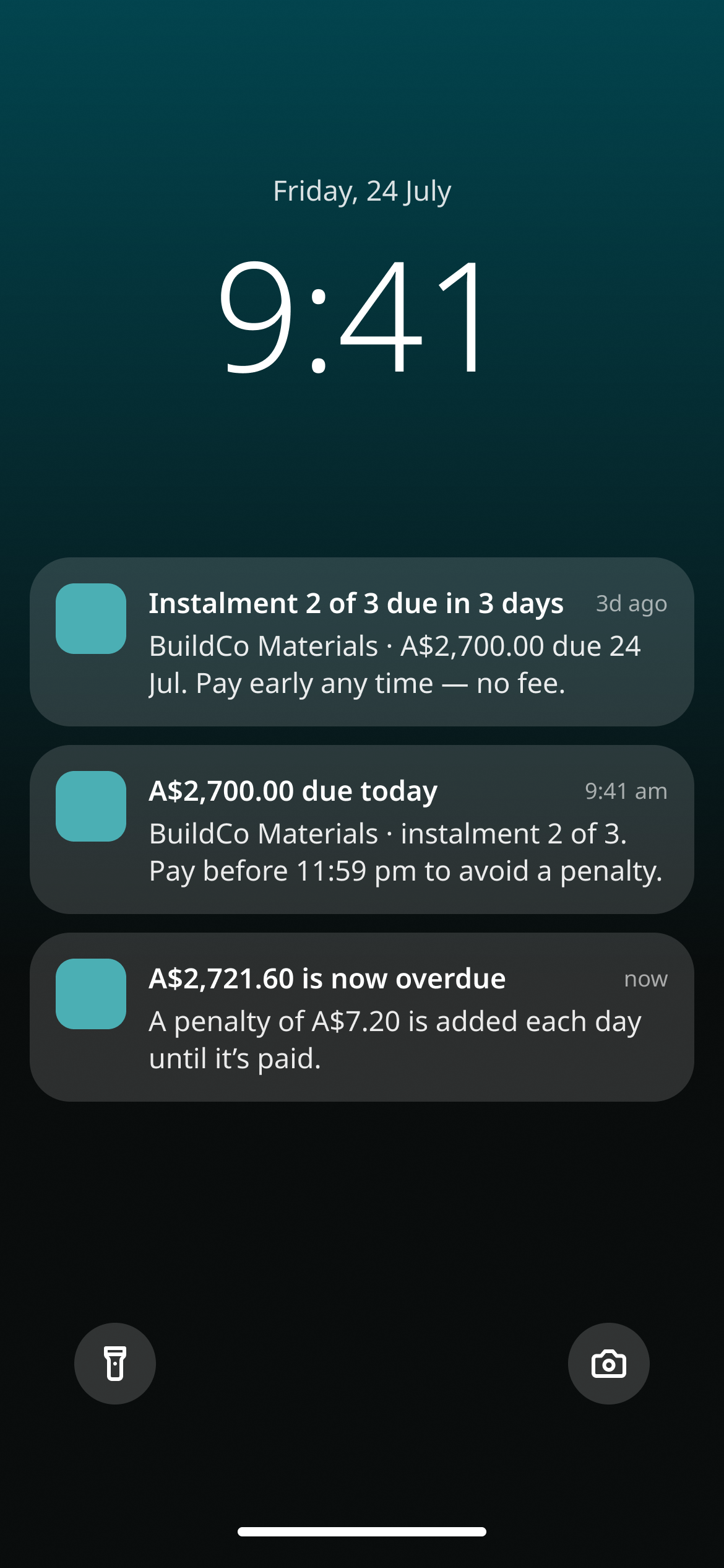
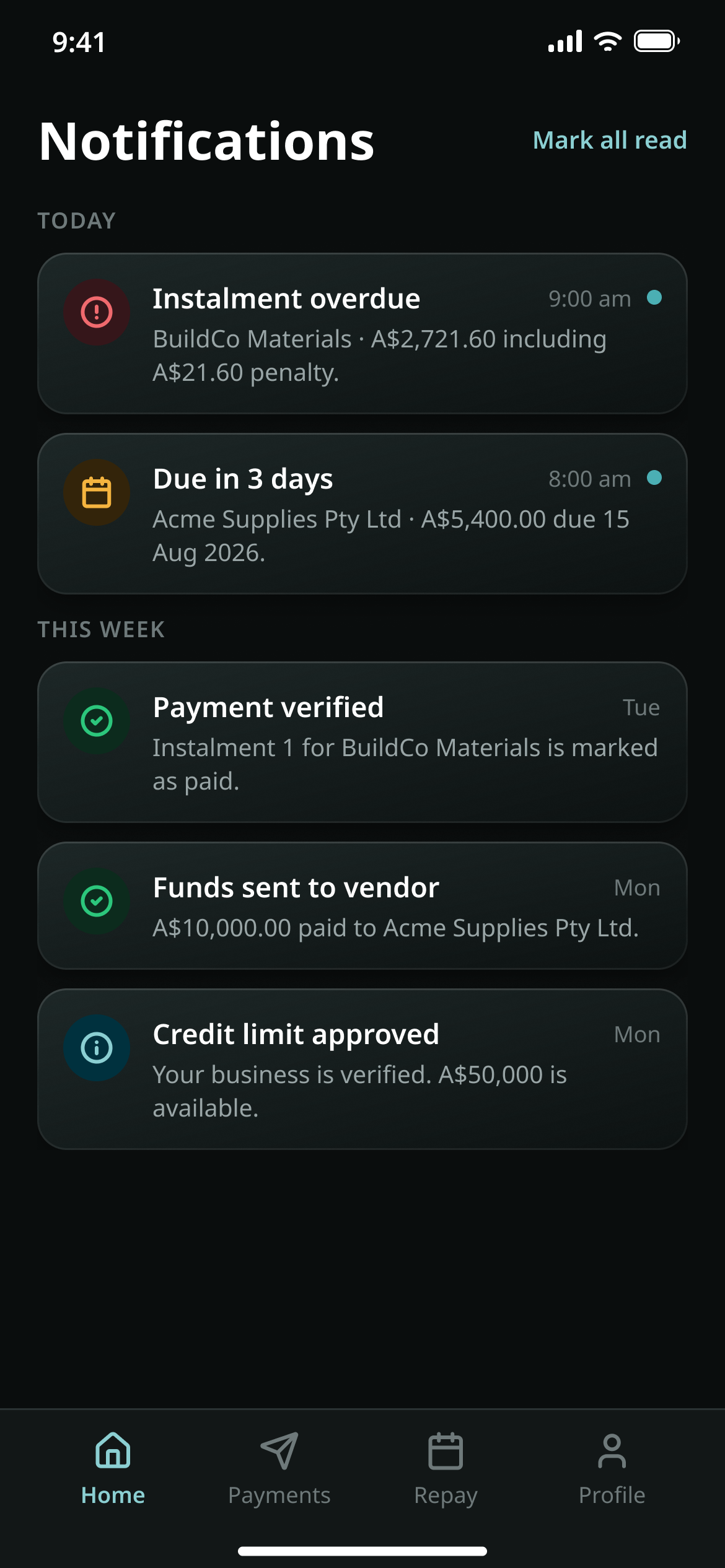
I raised these and designed for them: a term picker that shows the total cost as you choose, and due-date reminders with a notification centre.

How much do you need? An amount, a 3 / 6 / 9 month term picker, and the instalment schedule with the total repayable
Pick a term, see the total cost.
A phone lock screen with three notifications: an instalment due in three days, due today, and overdue
A reminder before the due date.
The notification centre: overdue, due soon, payment verified, funds sent to vendor, credit limit approved
Notification centre.

Found in the PRD

Term options in the app didn’t match the instalments in the back end.

So the simulated schedule and the real one could never match.

06 · Design system & brand

A system from zero, in two months

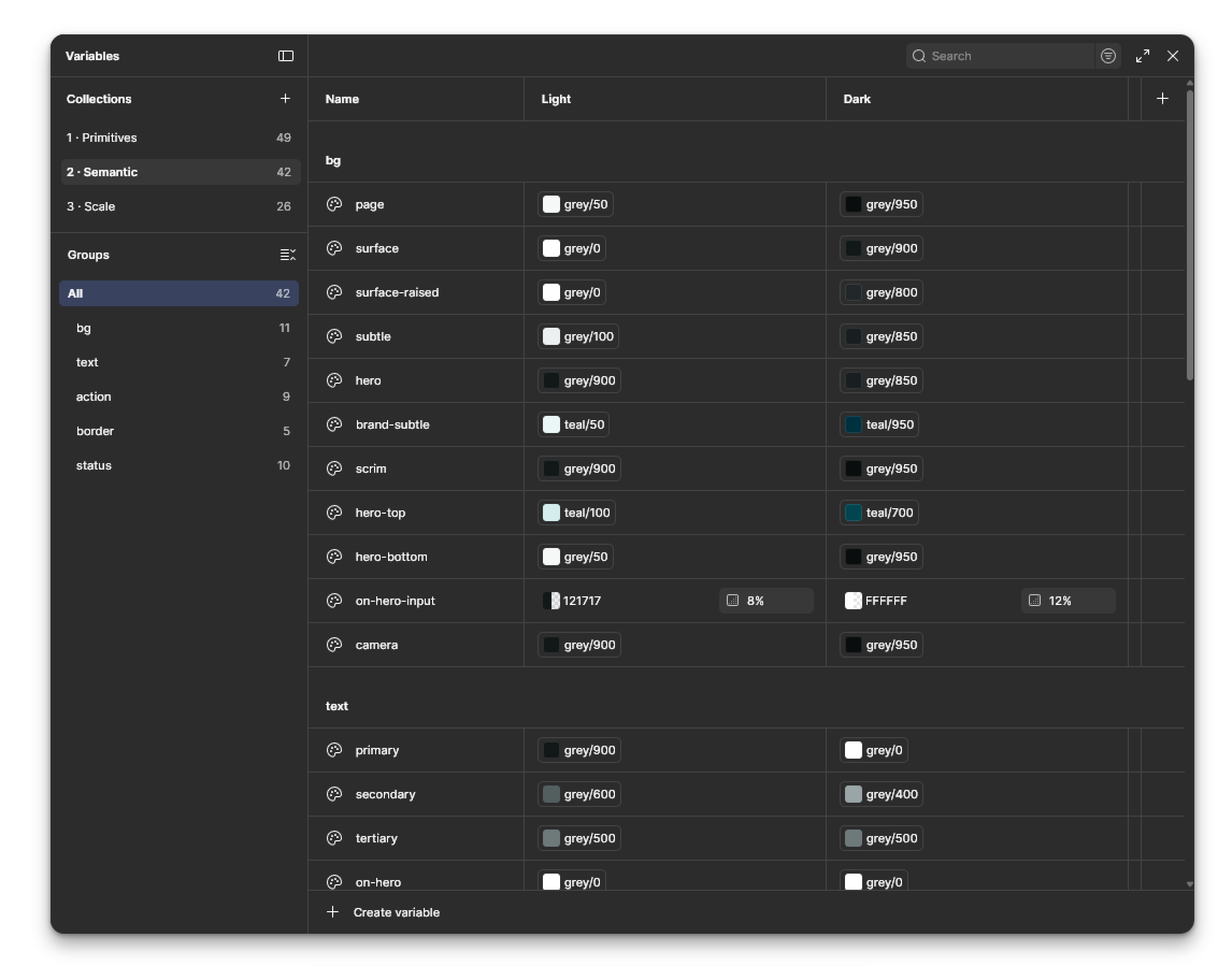
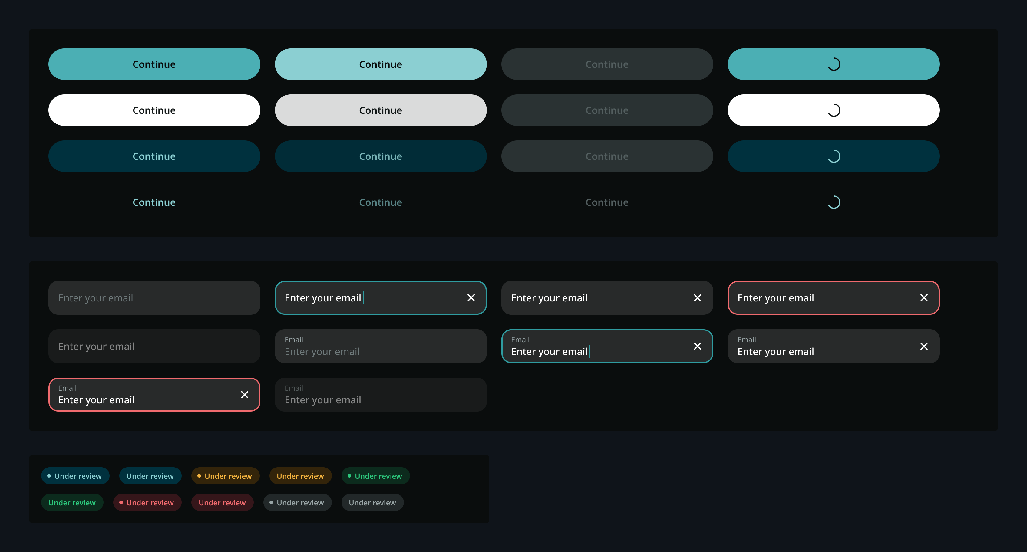
Three tiers of Figma variables (primitives, semantic light / dark, scale), 117 in all, with every text and status colour pair checked against WCAG 2.1 AA. Gradients and shadows can’t live in variables, so styles are the source of truth for those. Surfaces follow three levels, with one rule I like: only one glow per screen. Tokens export as JSON and CSS.

The logo was hand-drawn by the client. I vectorised it and produced the standardised outputs: app icons for iOS and Android, the single-colour Android notification icon, favicon and wordmark.

The Figma variables panel: three collections (primitives, semantic, scale) with light and dark values
Foundations: three tiers of variables.
Component sheet: button states, input states and status chips on the dark surface
Components.

Brand outputs

The client’s name and logo stay private while this case is anonymous.

Brand sheet, password-protected: the lockups, the app icon and the card.

Numbers

117 variables · 15 component sets · 35 icons

Counted in the file on 21 Sep.

07 · Working with AI

AI did the volume. The decisions stayed mine.

Two months, one designer, evenings and weekends, 110+ screens plus a back office and a design system: I ran this as an AI-assisted design sprint with Claude and the Figma MCP. I owned the research, the decisions and the review; AI did the volume. I reviewed every screen and checked each batch against the source.

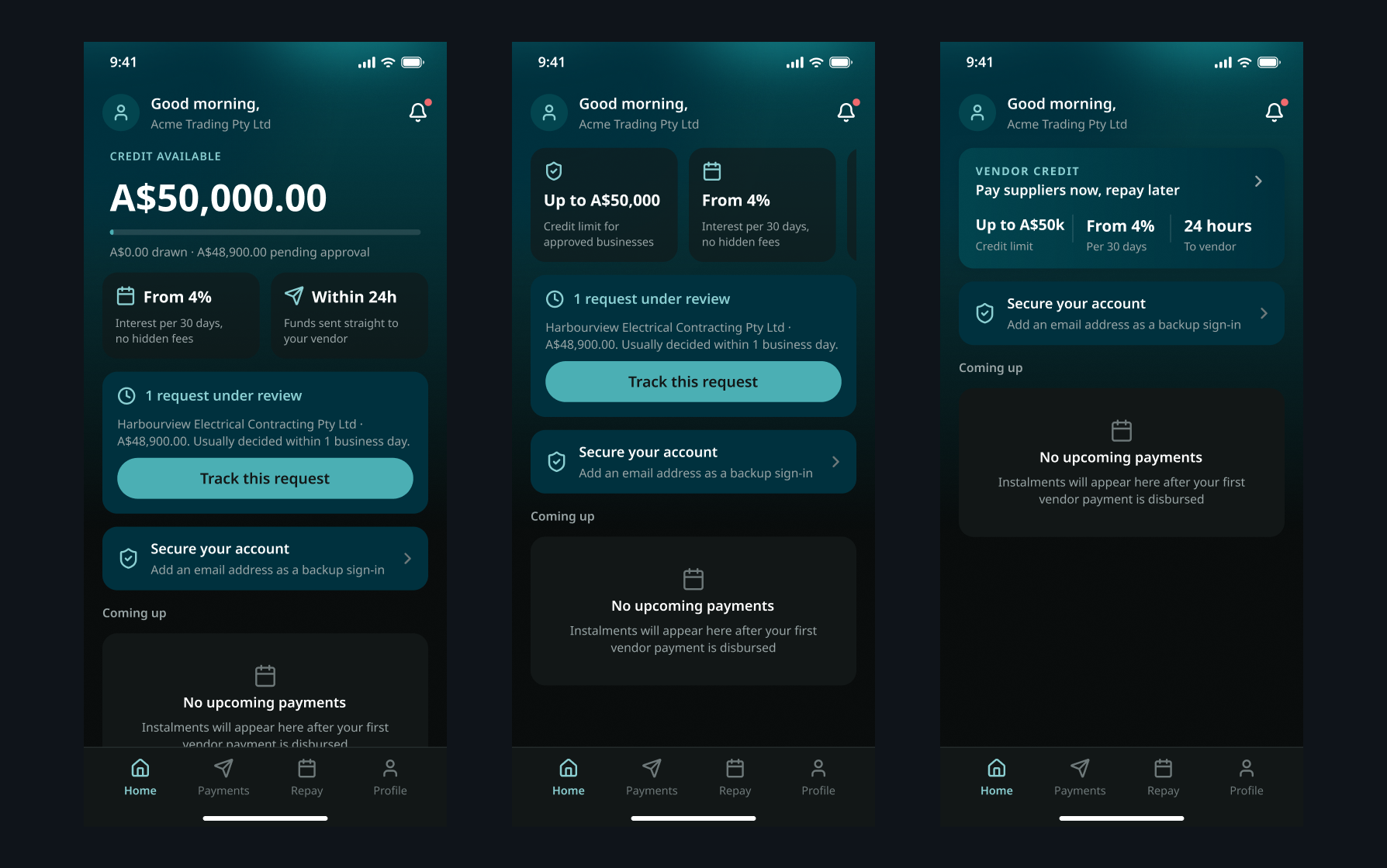
The home screen shows how the iteration went. I drew three options and walked the client through the trade-offs of each; they chose the card layout, and I refined the card’s materials for the final version.

Three home-screen options side by side: a large available-credit figure with a drawn-down bar, two summary tiles, and a vendor-credit banner
Three home-screen options, side by side.
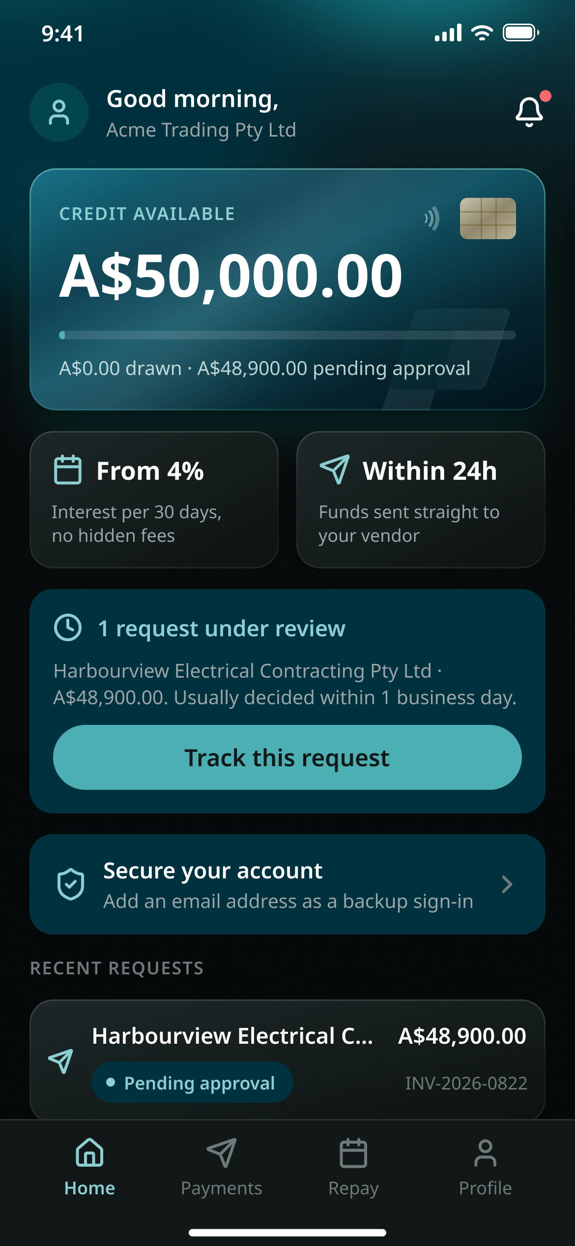
The final home screen: a card showing the available credit and the amount drawn, then the rate, the payment time, the request under review and recent requests
The card version, after the materials pass.

08 · Reflection

What I’d do differently

There was no merchant to walk the flow with before handoff, because there were no merchants yet; that is the first thing I would change. And the instalment-term mismatch I found in the PRD would have been cheaper to settle with the developer in week one than after the screens were drawn.