All work

Project · Digital health · Sydney

Cogniss

Cogniss is a no-code platform that lets creators and healthcare professionals build patient-focused apps from pre-built features based on validated behavioural-health techniques. I worked on the internal platform: a new data feature, an account-page audit and a survey-results redesign.

Role
Product Designer (Intern): UI/UX, interaction design, user-testing support
Timeline
May – Jul 2024
Team
Cogniss product design team, reporting to the design lead and paired with a design mentor
Scope
Web platform, internal tools, responsive
The Cogniss wordmark

Project goals

Enhance internal usability for smoother client management, and improve the clarity and accessibility of information across devices.

What I did

UI/UX design, interaction design and user-research support: from user flows and wireframes to high-fidelity prototypes and product documentation, in a Jira / Confluence agile workflow with engineers.

01 · New feature

Virtual Table: from user flows to a documented feature

A virtual table lets app creators upload and manage larger sets of data for user profiles, allowing for greater customisation and personalisation of an app’s content and overall user experience.

During prototyping I identified usability issues, including the readability of preview information in form checkbox selections; evaluated how data operations aligned with heuristic guidelines; and supplemented the documentation that defines when to use a modal and when to use a toast notification.

I took part in the end-to-end design of the feature, from the first user-flow concepts to high-fidelity prototyping, and was the primary designer of the high-fidelity prototype.
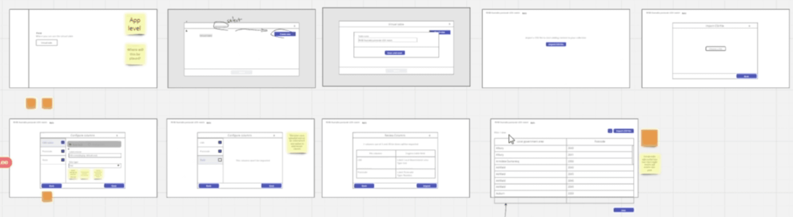
User flows for the virtual table, laid out as a sequence of wireframes
1.1 · User flows and wireframe discussions.
The interactive high-fidelity prototype of the virtual table feature
1.2 · Interactive high-fidelity prototype.
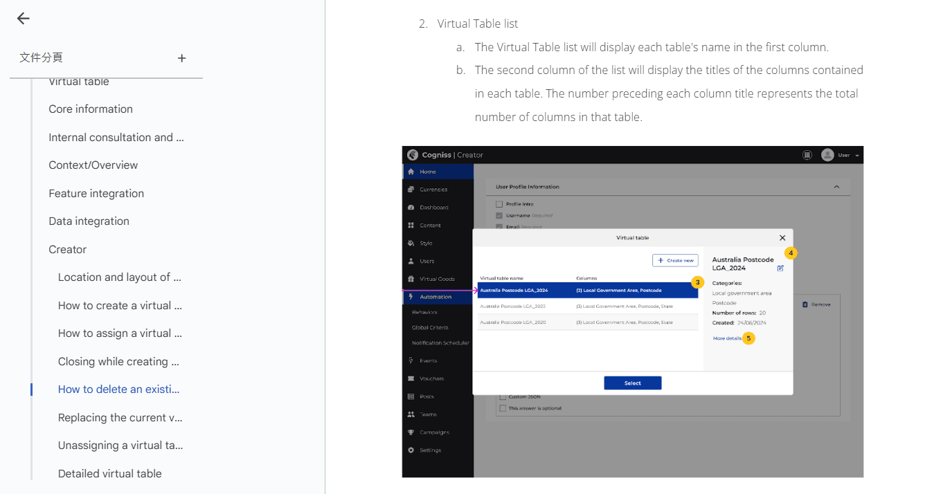
Product documentation page for the virtual table, first extract
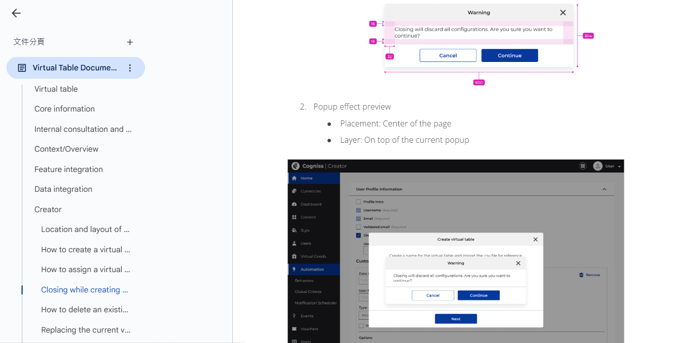
Product documentation page for the virtual table, second extract
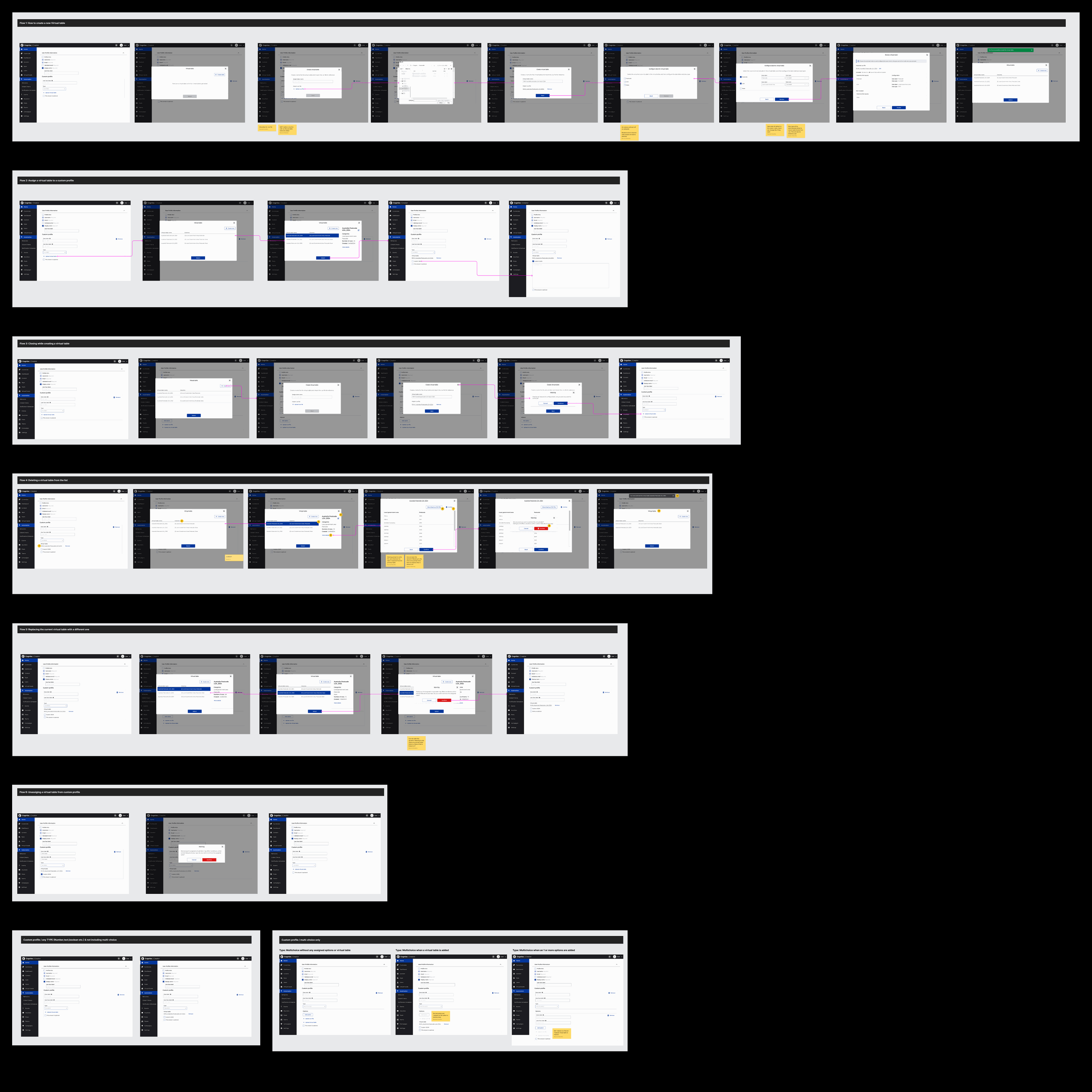
A strip of documentation screens: the six virtual-table flows, each as a row of annotated frames
1.3 · Product documentation extracts.

02 · Audit

Auditing the internal account page

The first task was a visual refinement and a detailed inspection of the account-management page. Through design audits and iterative adjustments, I made the UI consistent and visually clear.

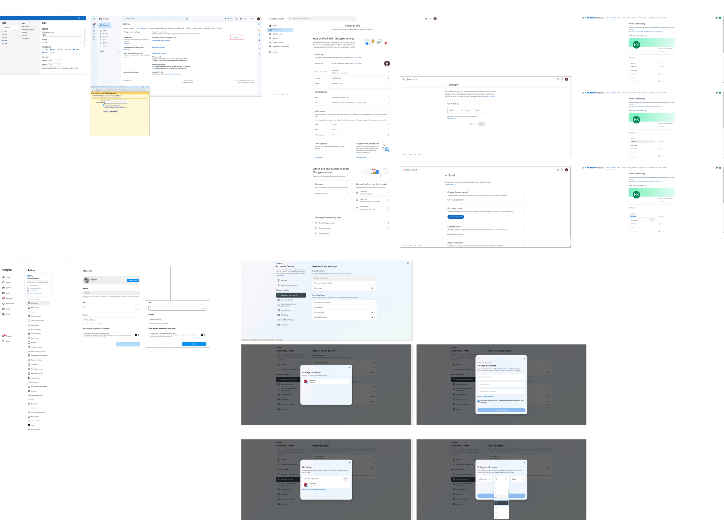
I reviewed how other platforms’ account pages handle input hierarchy, and moved direct form inputs into modal dialogs, which resolved unclear requirements and the difficulty of making the inputs responsive.

Competitive analysis board: account pages from other platforms, annotated
2.1 · Competitive analysis and product design audit.
Design audit of the account-management page with notes on each issue
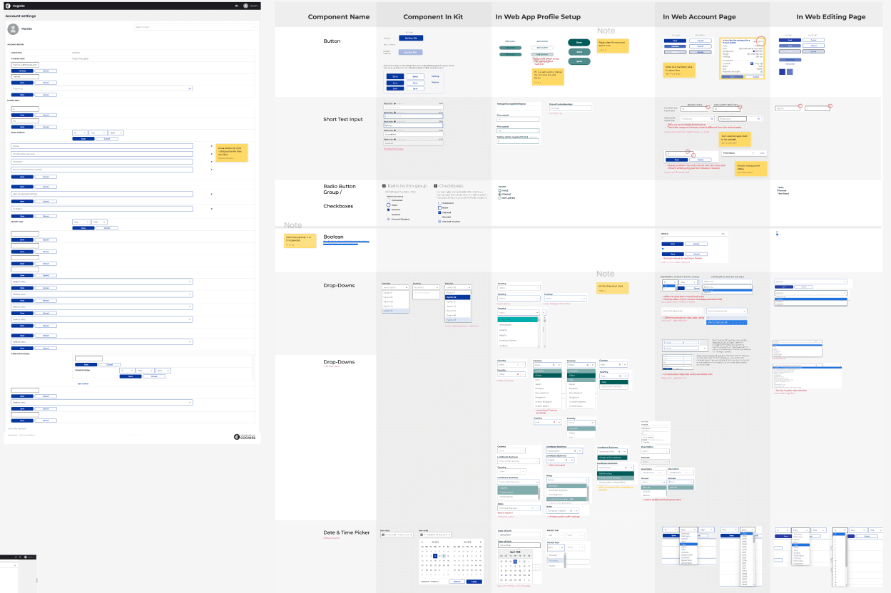
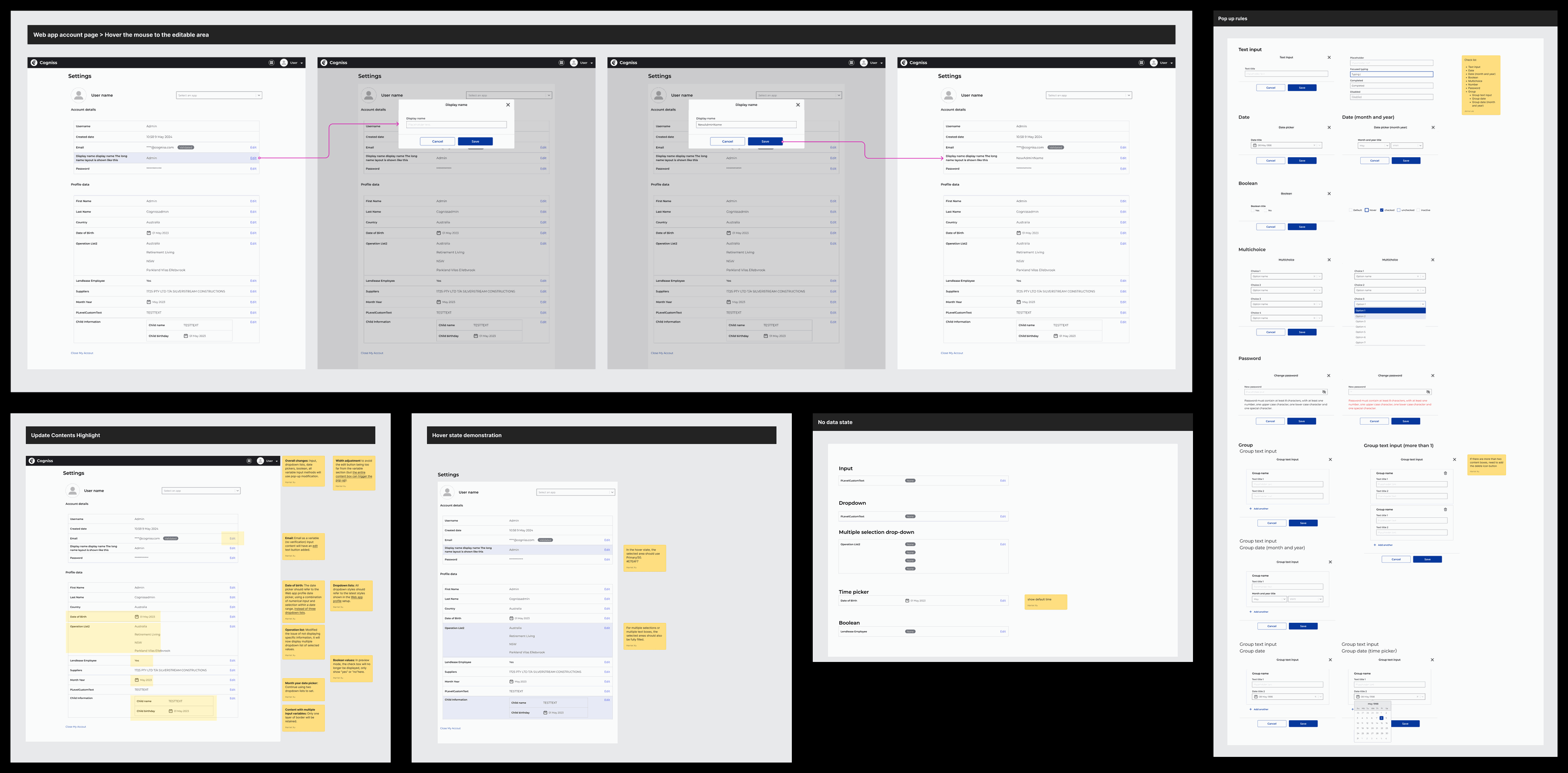
High-fidelity prototypes of the account page with modal dialogs, and the input states and validation rules beside them
2.2 · High-fidelity prototypes and modal guidelines: input states and validation.
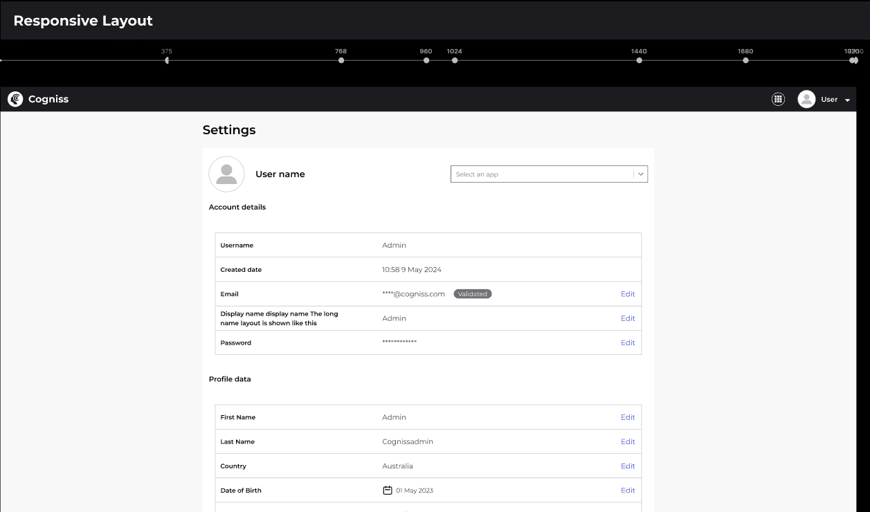
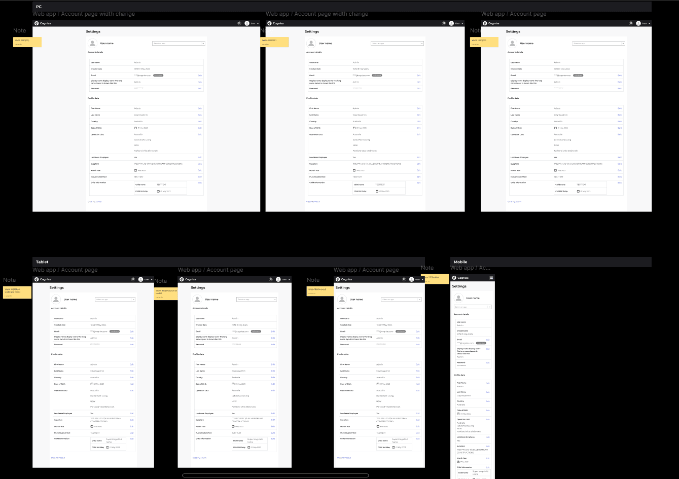
Responsive design requirements for the account page, desktop and mobile
2.3 · Responsive design requirements.
Responsive design requirements, second sheet

03 · Redesign

Survey results, made readable

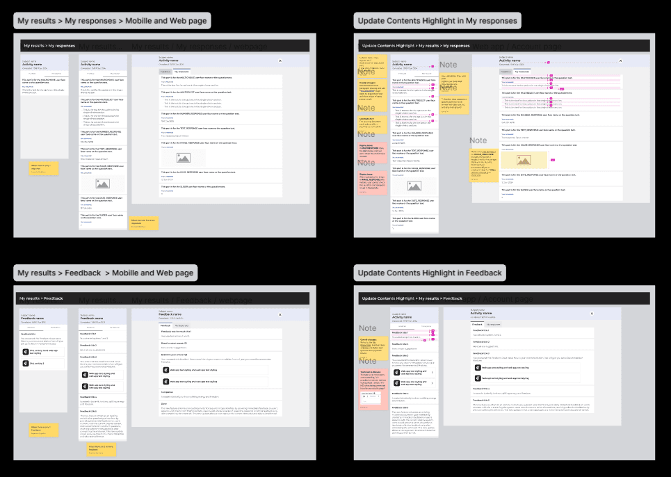
The previous survey page was hard to read: inadequate spacing and inconsistent image cropping. After a design review I adjusted the text spacing and standardised the image cropping, which improved readability on both mobile and desktop.

The survey results pages, mobile and web, with notes on spacing and image cropping
Survey results page: adjusted text spacing and standardised image cropping.

What changed

Spacing between text, and one crop rule for every image.

Readable on mobile and desktop.

04 · Testing

Sitting in on usability tests

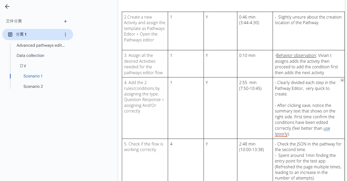
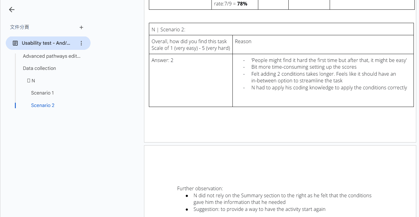
I took part in several user-testing sessions, recording user errors and identifying scenarios that led to inefficient interactions or delays, then turned them into insights and recommendations for the next round of design.

Notes from a usability test session
Usability test sessions.
Notes from a second usability test session

Recorded

User errors, as they happened.

Identified

Scenarios that caused slow or inefficient interactions.

Fed back

Insights and recommendations for the next design round.