All work

Project · Live streaming · Shanghai

bilibili Live

bilibili Live Assistant is the companion app streamers use to go live on bilibili. The first release shipped on a tight timeline and drew negative feedback, so the redesign set out to shorten the path to going live, calm the layout down, and build a component library the whole team could share.

Role
UI/UX Designer (Intern): design review, process optimisation, hi-fi prototypes, design guidelines with my mentor
Timeline
Jun – Nov 2021
Team
With a design mentor, PMs and developers on the broadcasting side
Tools
Sketch, Figma
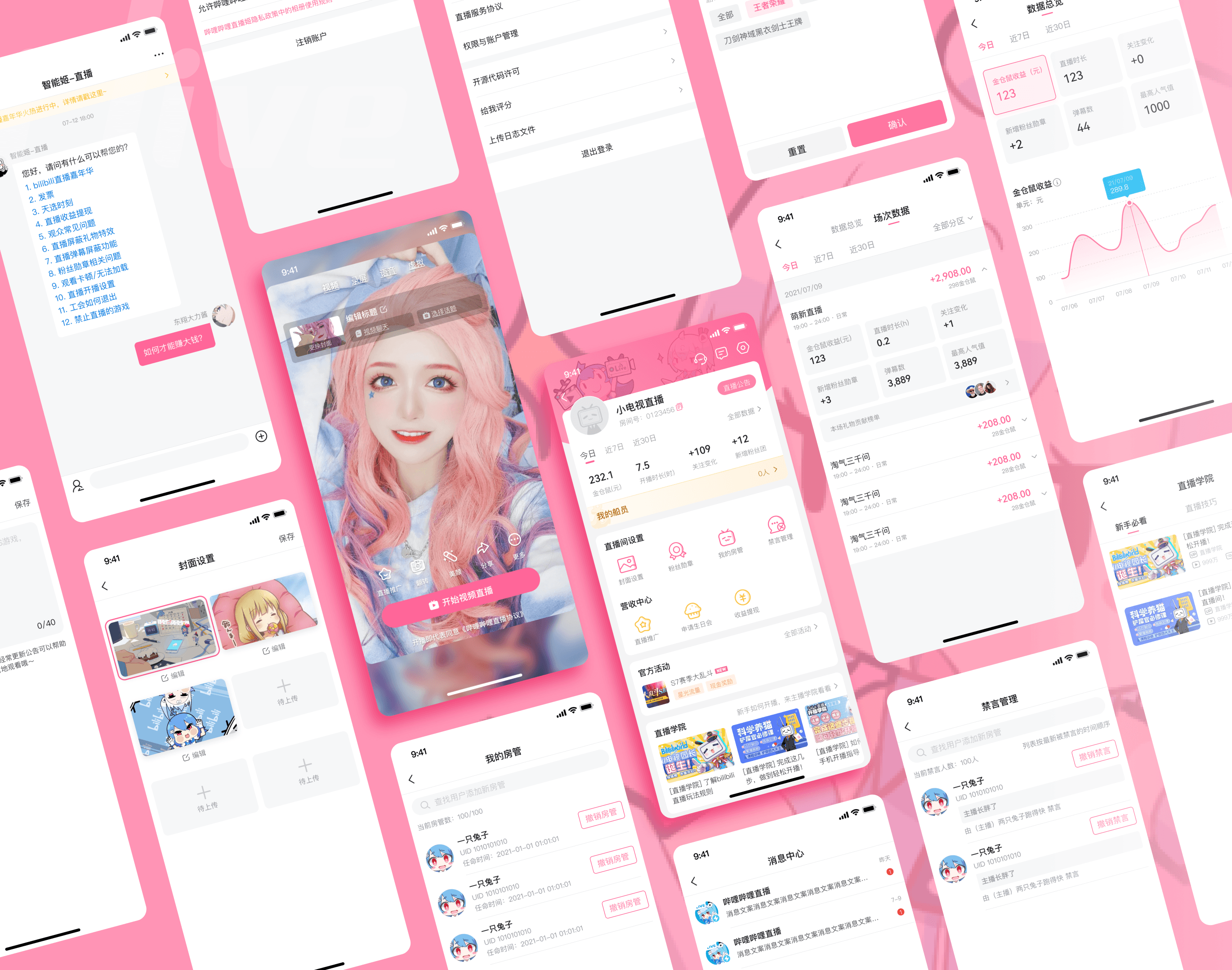
A spread of bilibili Live Assistant screens: the Go Live page, the Host Center, data views and the streaming room, on a pink background

Background

bilibili is one of China’s leading video platforms, popular with younger audiences for its community-driven content and live streaming.

Problem

A review of the first release and research with streamers surfaced three problems: a cluttered UI with high cognitive load, friction in setup and data views, and no cohesive design system.

01 · Structure

A shorter path to going live

Start Live moved to the top level: it is now the first screen people see when they open the app, so streamers can fill in what’s needed and go.

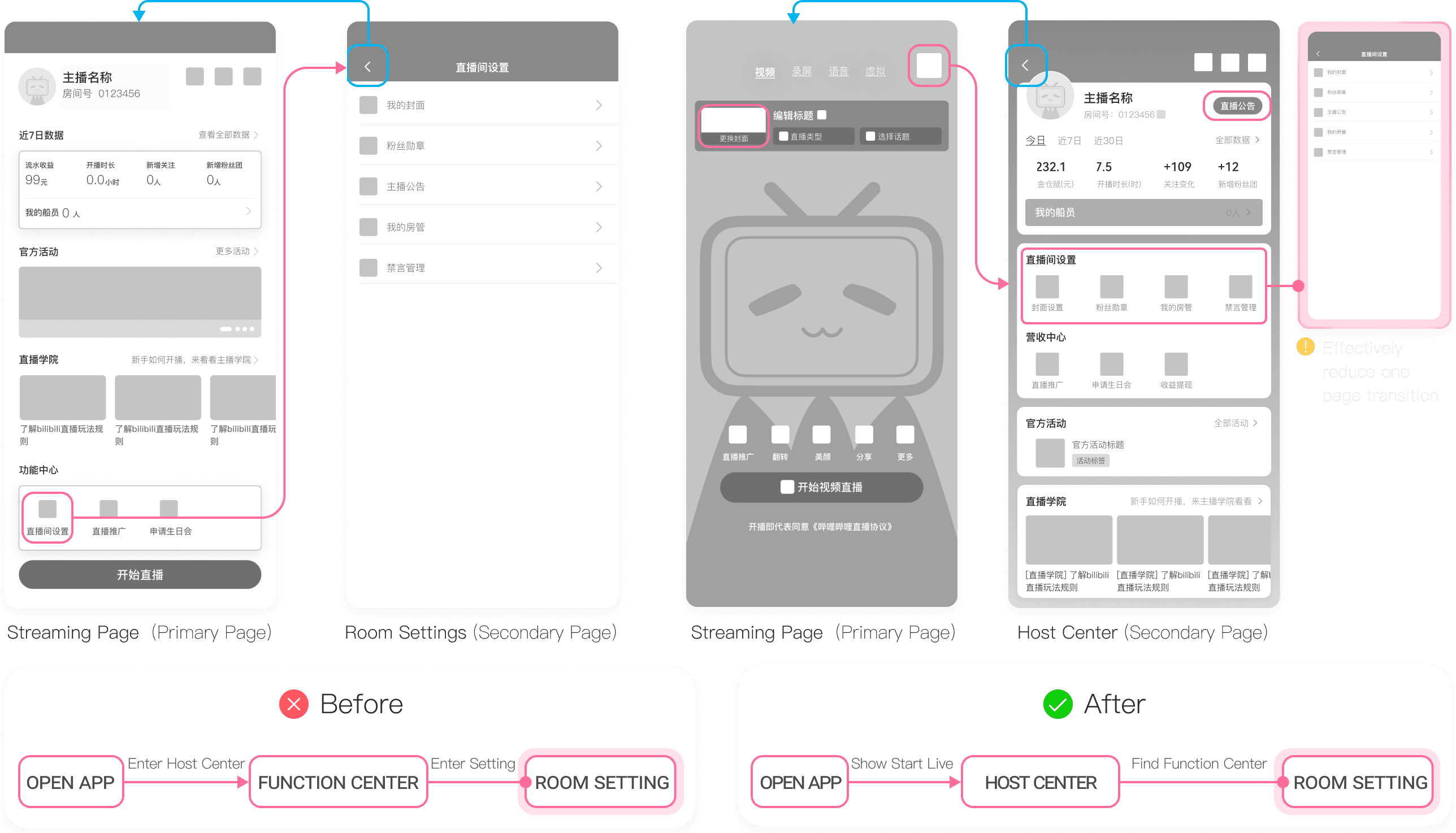
Live Room Settings used to be a sub-page of the Host Center, the streamer’s dashboard. Its functions were merged into the Host Center as categorised cards, which removed an extra transition, and the Host Center became reachable from the Go Live page, which flattened the hierarchy.
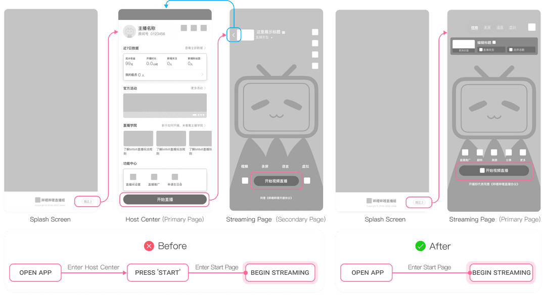
Before and after screen flows: Open app → Host Center → Start → streaming, against Open app → Start page → streaming
Start Live moved to the top level.
Flow diagram: Live Room Settings merged into the Host Center
Live Room Settings merged into the Host Center as categorised cards.

01 · Structure · Layout

Host Center and streaming room, regrouped

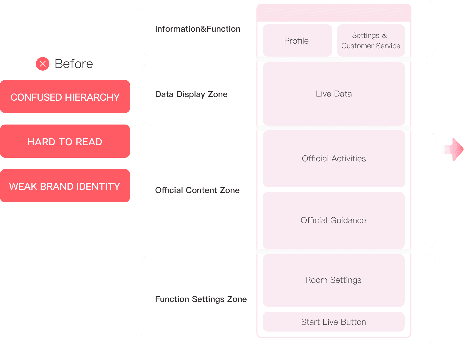
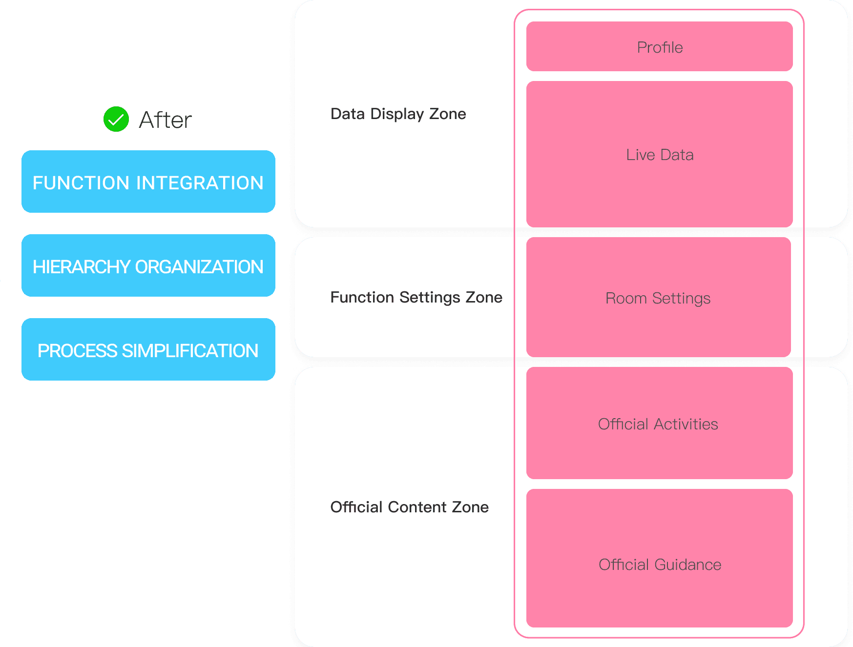
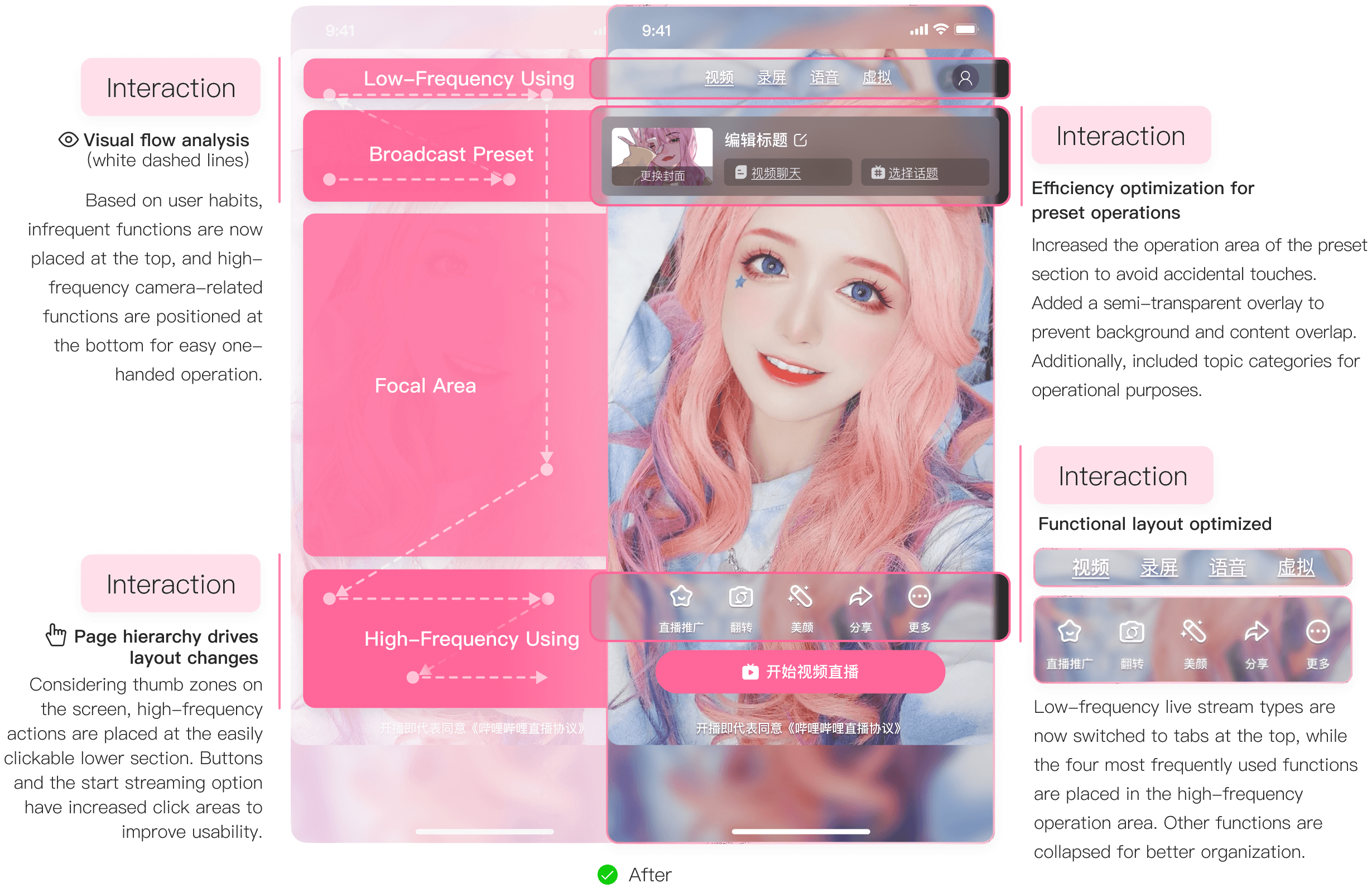
Related functions were scattered, which made both screens feel cluttered. The redesign grouped them: the Host Center into data, settings and official content, and the streaming room by how often each control is used.

Before: the Host Center’s information architecture, marked confused hierarchy, hard to read, weak brand identity
Host Center structure, before.
After: the Host Center reorganised into data display, function settings and official content zones
After: three zones.
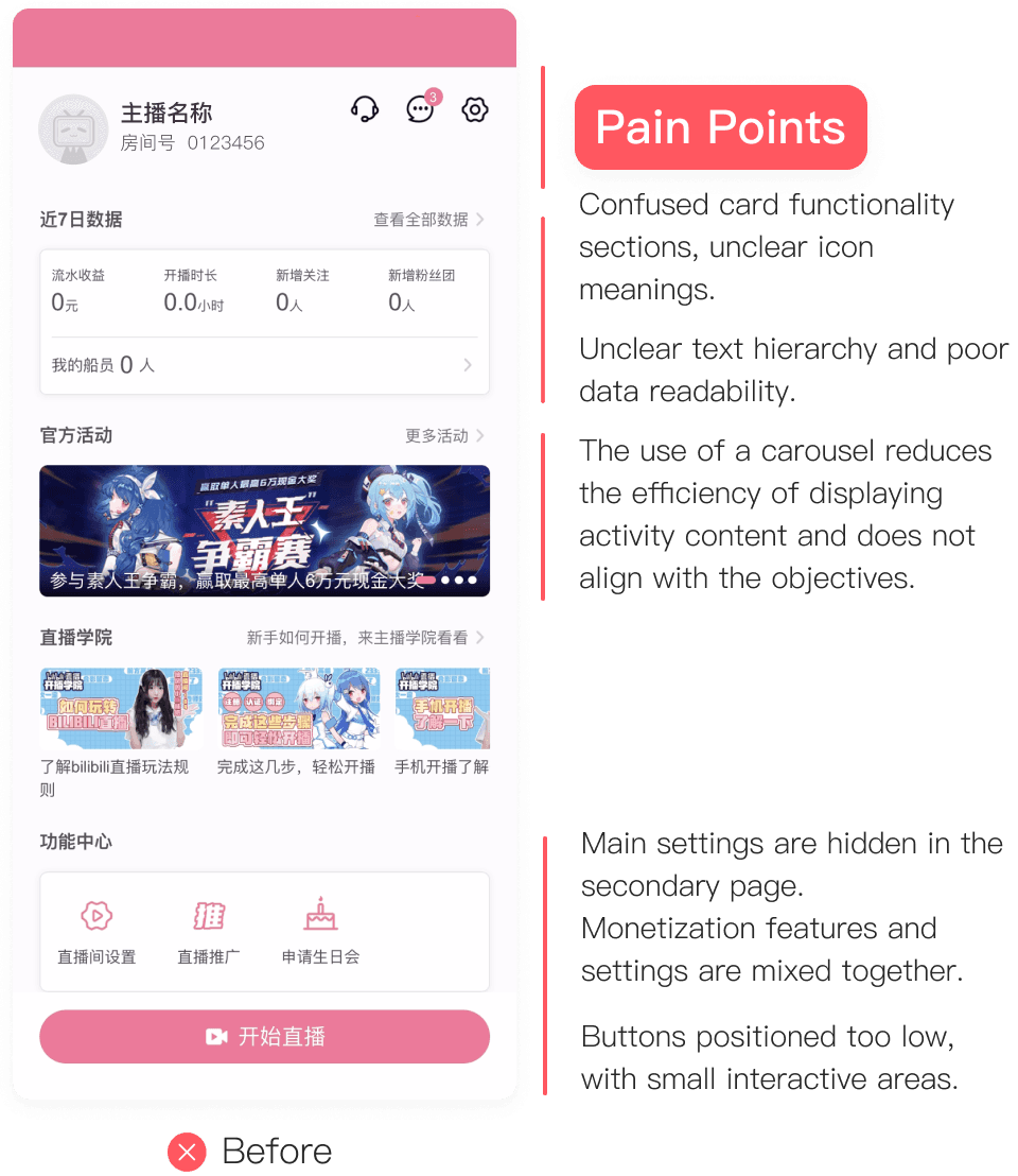
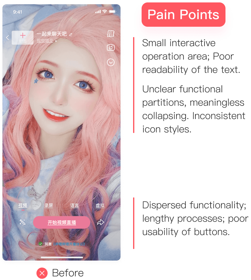
Before: the old Host Center screen with its pain points called out
Host Center screen, before.
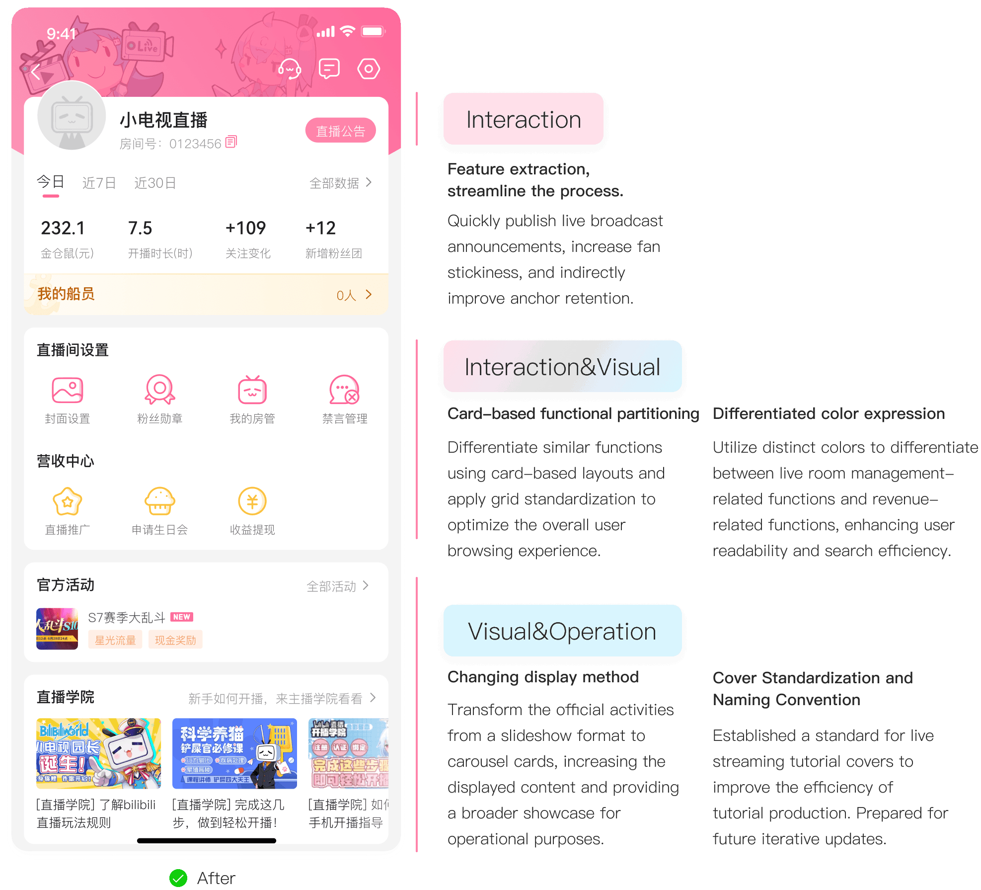
After: the redesigned Host Center screen, annotated
After: settings and revenue on separate cards.
Before: the old streaming room screen with its pain points called out
Streaming room, before.
After: the redesigned streaming room, with low-frequency and high-frequency controls separated
After: frequent controls within thumb reach.

02 · Component library

A component library four groups could agree on

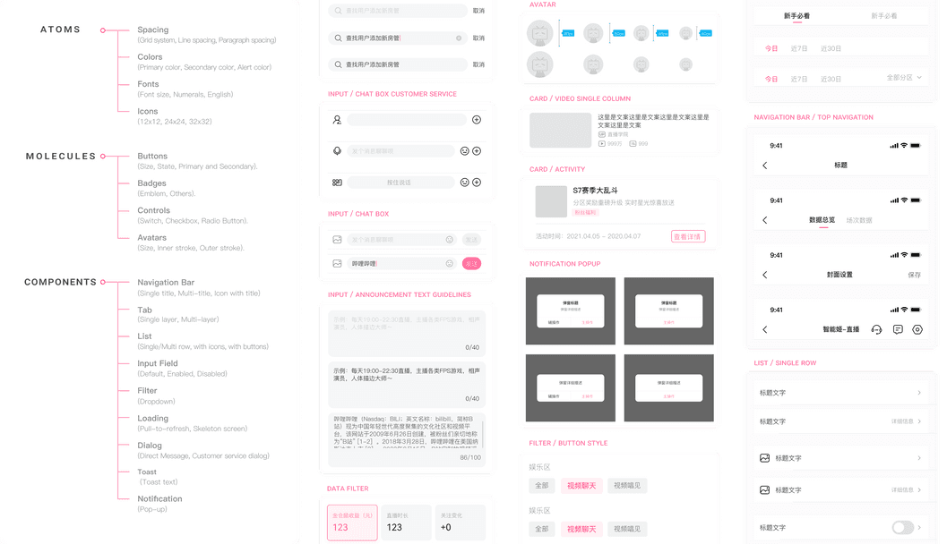
To improve design efficiency and communication with product and development, I built the Live Assistant component library together with my mentor on the broadcasting side.

It is organised in three levels: atoms (spacing, colour, type, icons), molecules (buttons, badges, controls, avatars) and components (navigation bars, tabs, lists, inputs, dialogs, toasts).

Designers

Component properties in Figma make applying components quick and accurate, saving repetitive work.

PMs

Modular, standardised components cut communication cost and speed up iteration.

Developers

Consistent components mean less time fixing visual details and more on code quality.

Users

Consistent colour and recognition make the app more intuitive and efficient.

The Live Assistant component library in Figma: an index of atoms, molecules and components beside the component sheets
Component library: atoms, molecules, components.
Icon set and colour specifications
Icon and colour specifications.
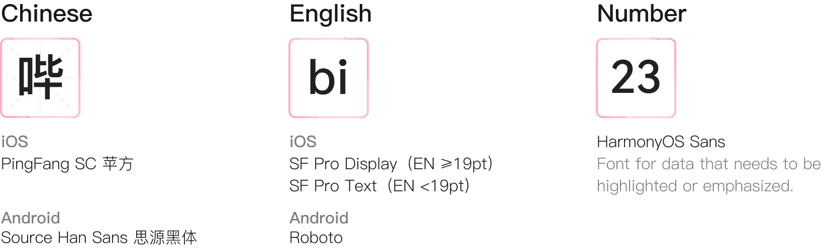
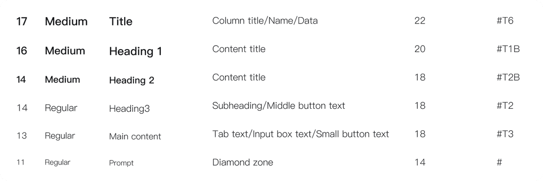
Typography scale for the app
Typography, redesigned around the audience’s preferences.
Typography in use on app screens

03 · Testing

Thirteen streamers, old version against new

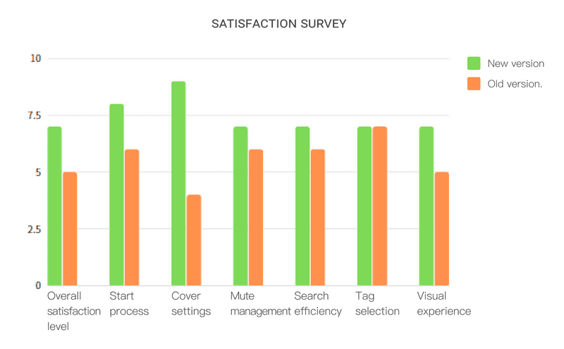
Thirteen experienced streamers took part in a satisfaction comparison between the old and new versions. Overall satisfaction was significantly higher for the new version.

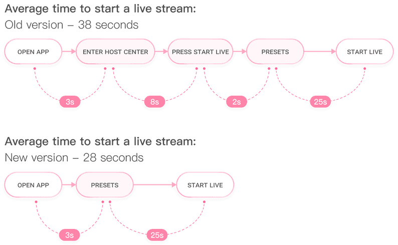
Flow diagram: average time to start a live stream, 38 seconds in the old version against 28 in the new
Average time to start a live stream: 38 seconds before, 28 after.
Bar chart: satisfaction survey, new version against old, across seven measures
Satisfaction survey, old vs new, 13 streamers.