All work

Case study · Fintech · Ironfly Technologies

GLOSS Vault

A personal-finance vault that has to behave across two platforms and two colour modes, with one designer owning every flow from brief to handoff.

Role
Sole product designer: discovery, flows, UI, design system, handoff
Timeline
Jul 2024 – present
Team
A PM, the engineering team, and one designer per flow. On GLOSS Vault that designer is me.
Scope
Desktop and mobile, light and dark
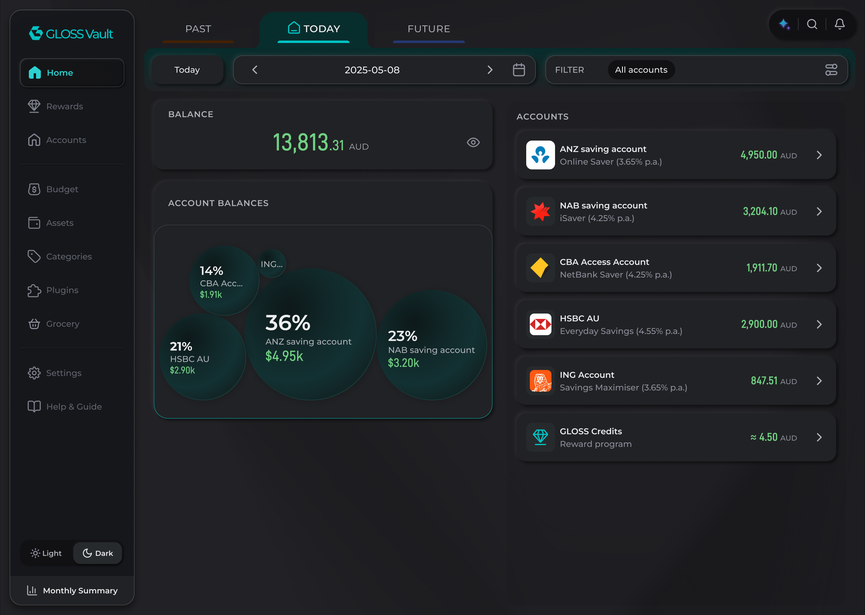
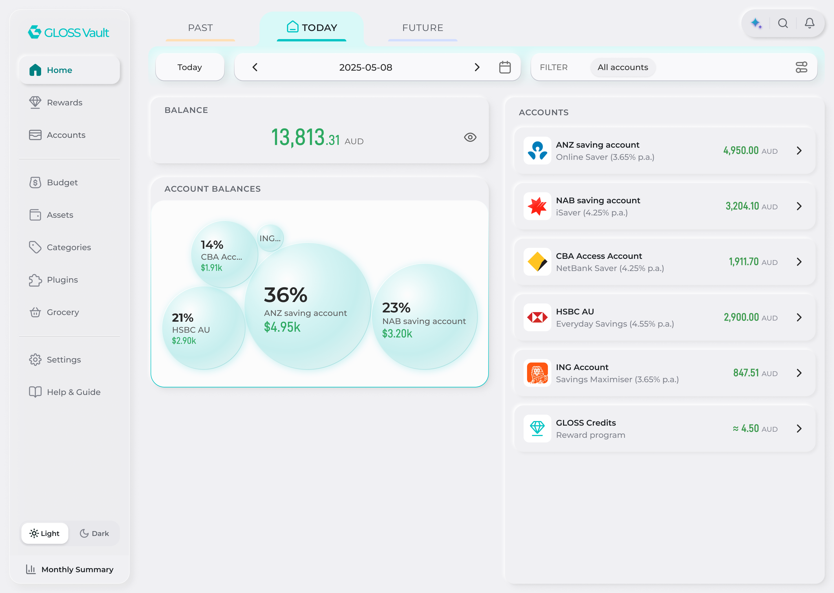
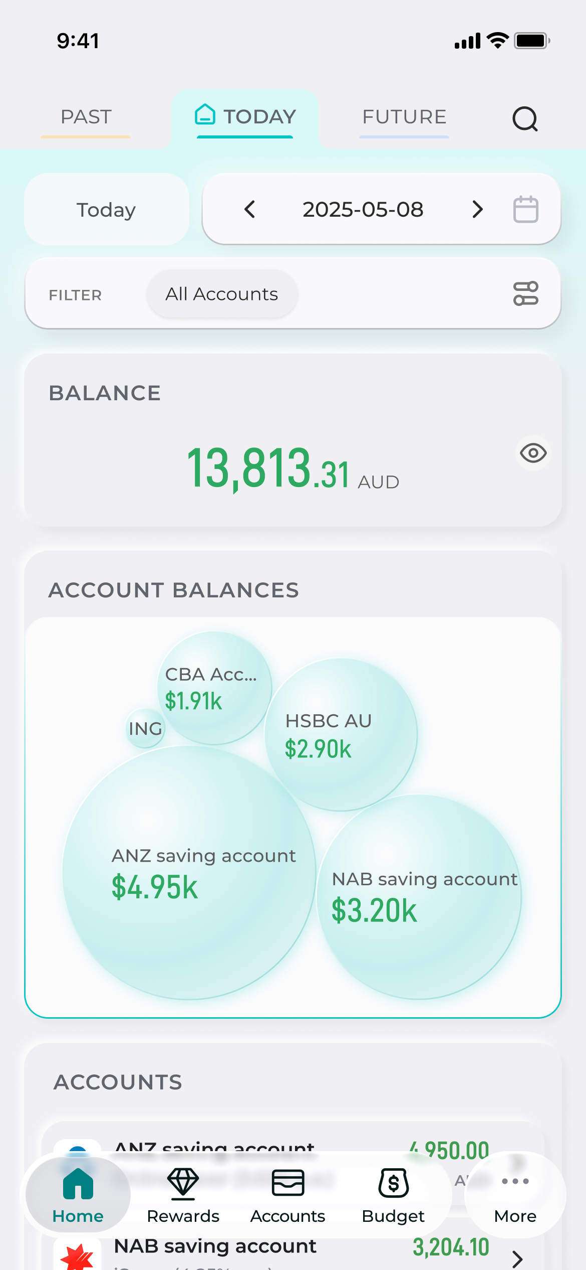
GLOSS Vault home screen on desktop: an asset bubble chart beside the account list The same home screen on a phone
The home screen: every account in one place, as an asset bubble chart instead of a spreadsheet.
Accounts come in one by one, and the bubbles grow with them.
Past, Today, Future: the same screen at three points in time.
Search across accounts and transactions, down to the empty state.

In motion

Three cuts from the promo I made for GLOSS Vault in 2025. It ran as a sponsored chapter in Irene Zhu’s The 11 Money Lies Keeping You Broke ↗.

Background

GLOSS Vault lets people pull their financial life (bank, credit, brokerage and “everything else” accounts) into one place, then budget and track against it. It’s an early-stage product built by a small team, and I’m the only designer.

What I did

Requirements usually arrived as a single sentence: a goal, not a spec. There was no researcher, no design ops and no PRD, so I built my own process for every feature: clarify the goal with the PM, map the current flow, study how comparable products solve it, define the scope, then design. Desktop and mobile, light and dark, every time.

01 · Add account

Designing around what we couldn’t build

The ideal: connect once, and let the API pull accounts and transactions automatically. The constraint: API coverage was uneven across regions and engineering was focused on the core product, so sync couldn’t reach every account. Alongside synced accounts, people can create one by hand (four account types, each with its own fields) and give it a balance and transactions.
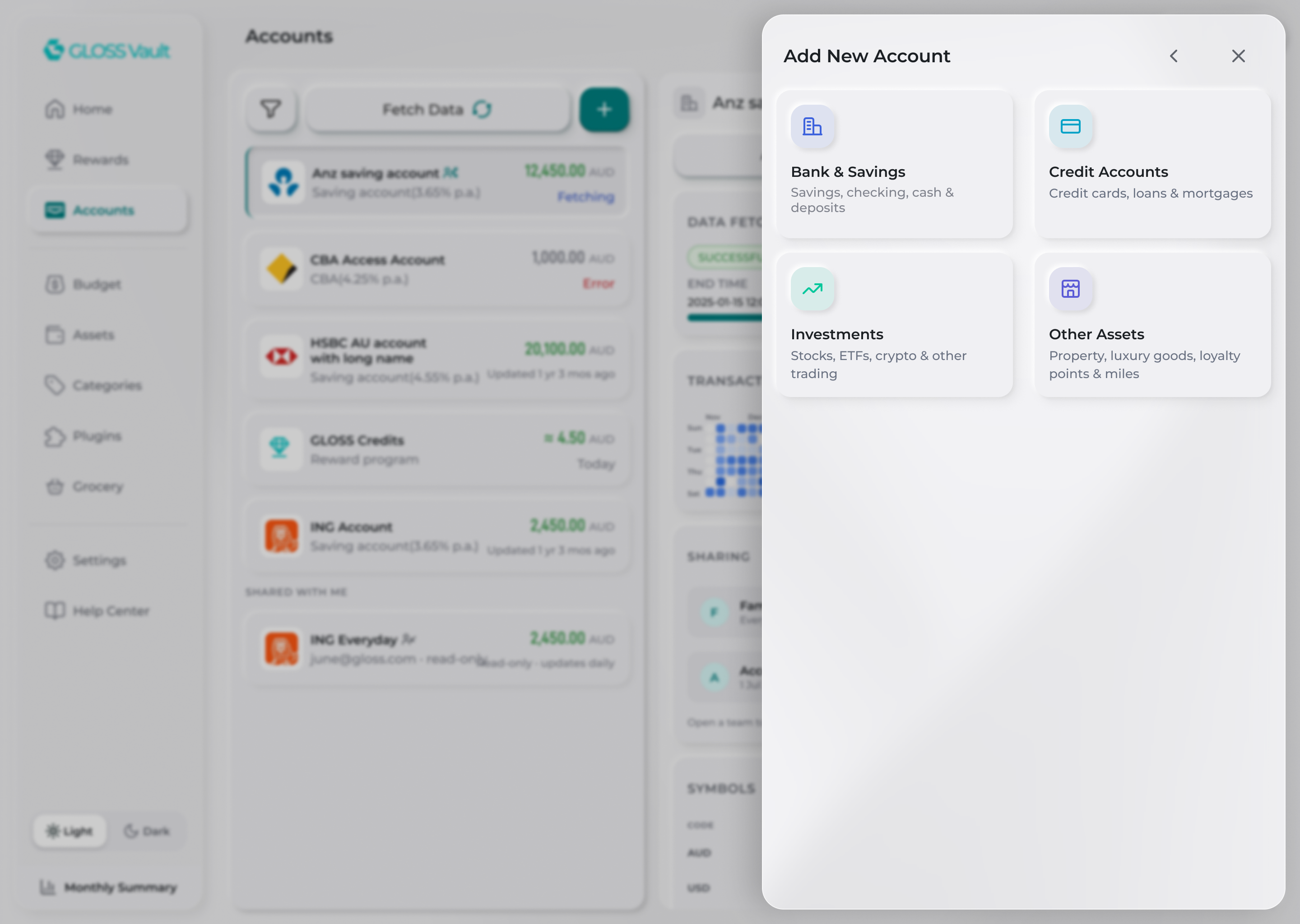
Add account, step 1: pick an account type, each explained with examples
1 · Pick a type, explained with examples.
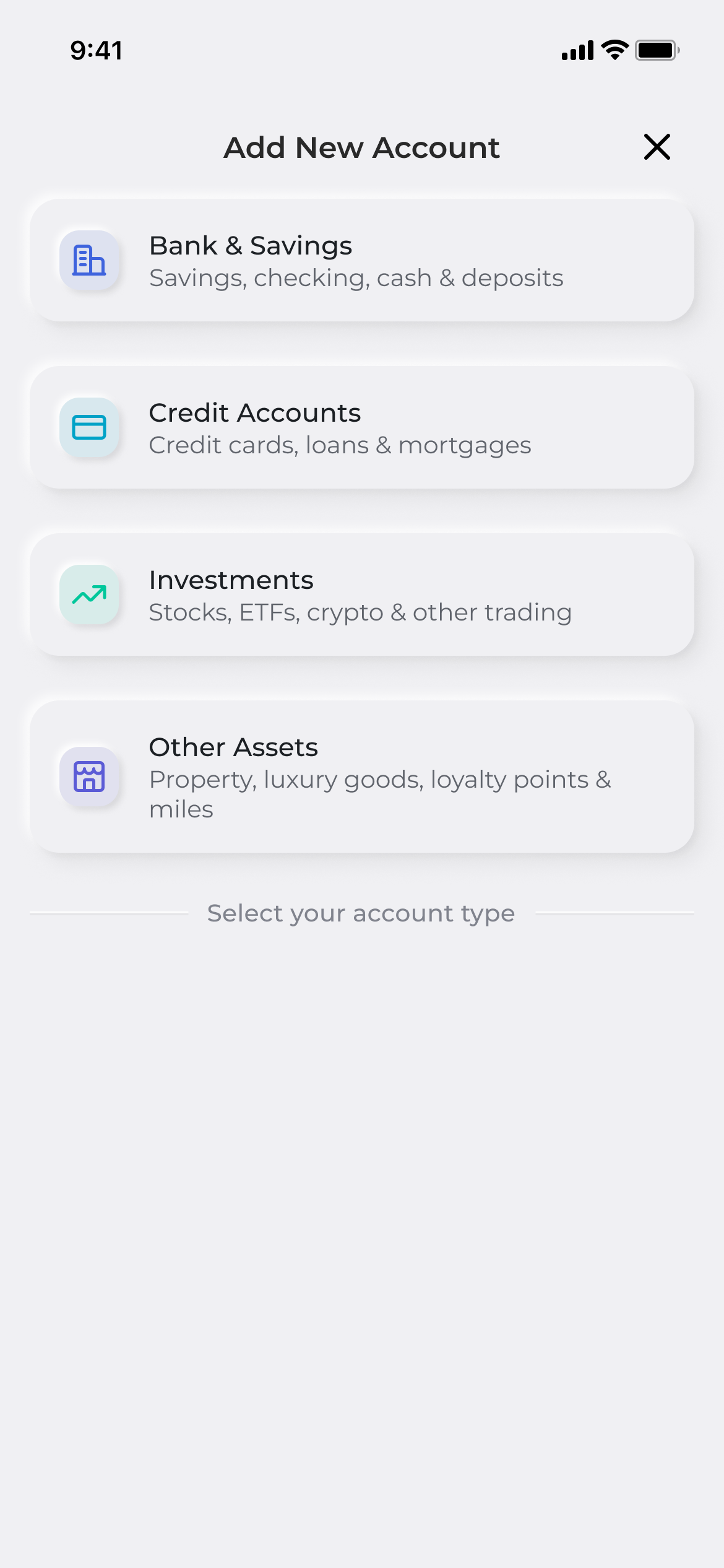
Step 1 of add account on a phone: choosing an account type
Step 1 on mobile.

The decision

If entry has to be manual, make it hard to get wrong and easy to recover.

The change

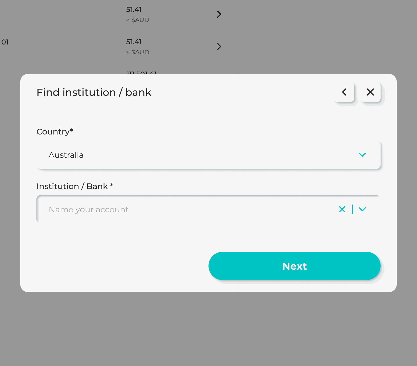
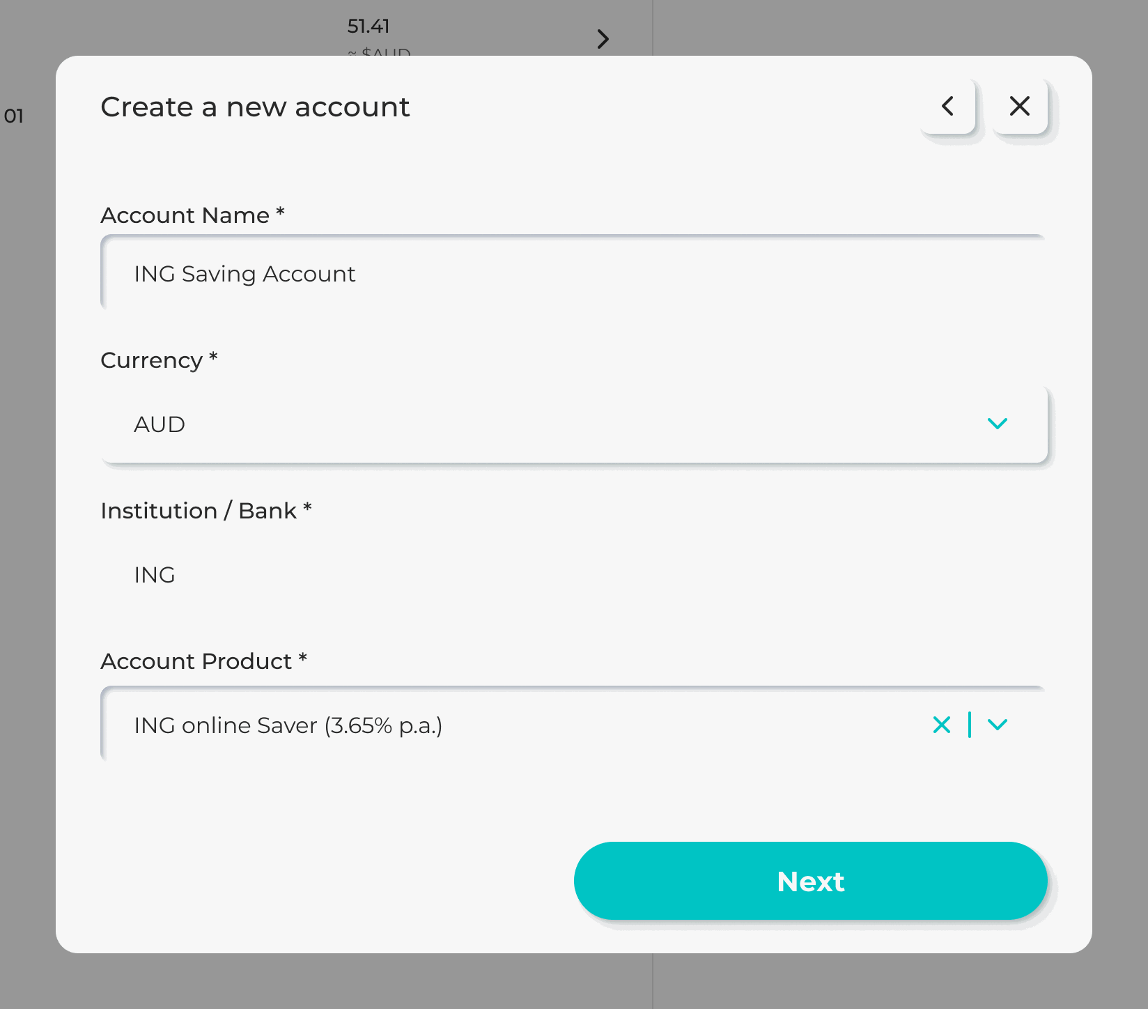
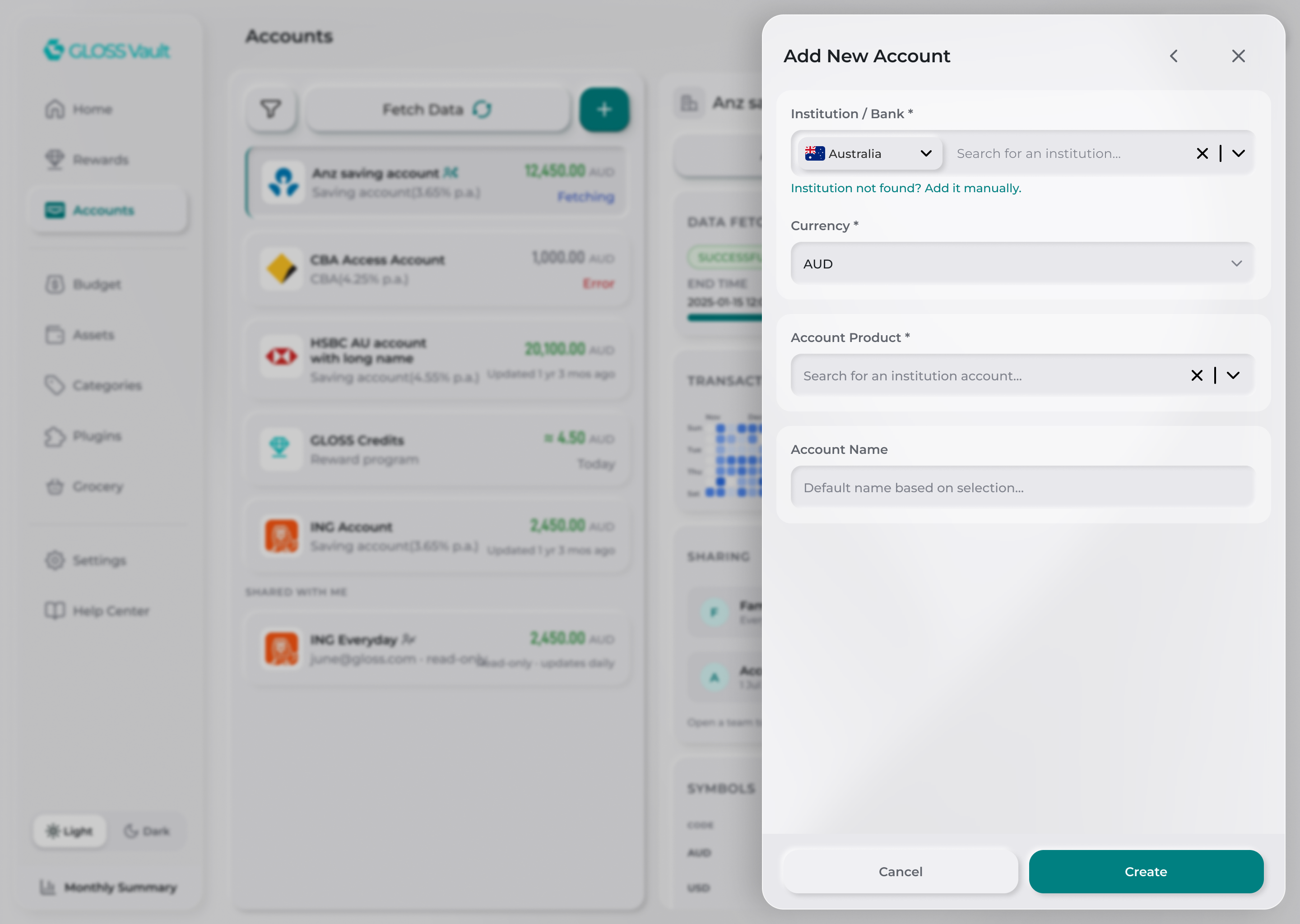
The first version split this across two modals: one to find the bank (country first, then institution), then a second for the account itself. A modal only has so much room, and the second one was already full. I moved the flow into a side sheet and merged country and bank into one field, a country picker inside the bank search. A bank that isn’t listed can be added by hand from the same spot.

The old flow, first modal: Find institution / bank, with Country and Institution / Bank as two separate fields and a Next button
Before, 1 of 2: find the bank.
The old flow, second modal: Create a new account, with account name, currency, institution and account product
Before, 2 of 2: the account.
Add account, step 2: one side sheet, with the country picker inside the Institution / Bank search and a link to add a missing bank by hand
After, step 2: one side sheet, with country and bank in one field.

Manual entry

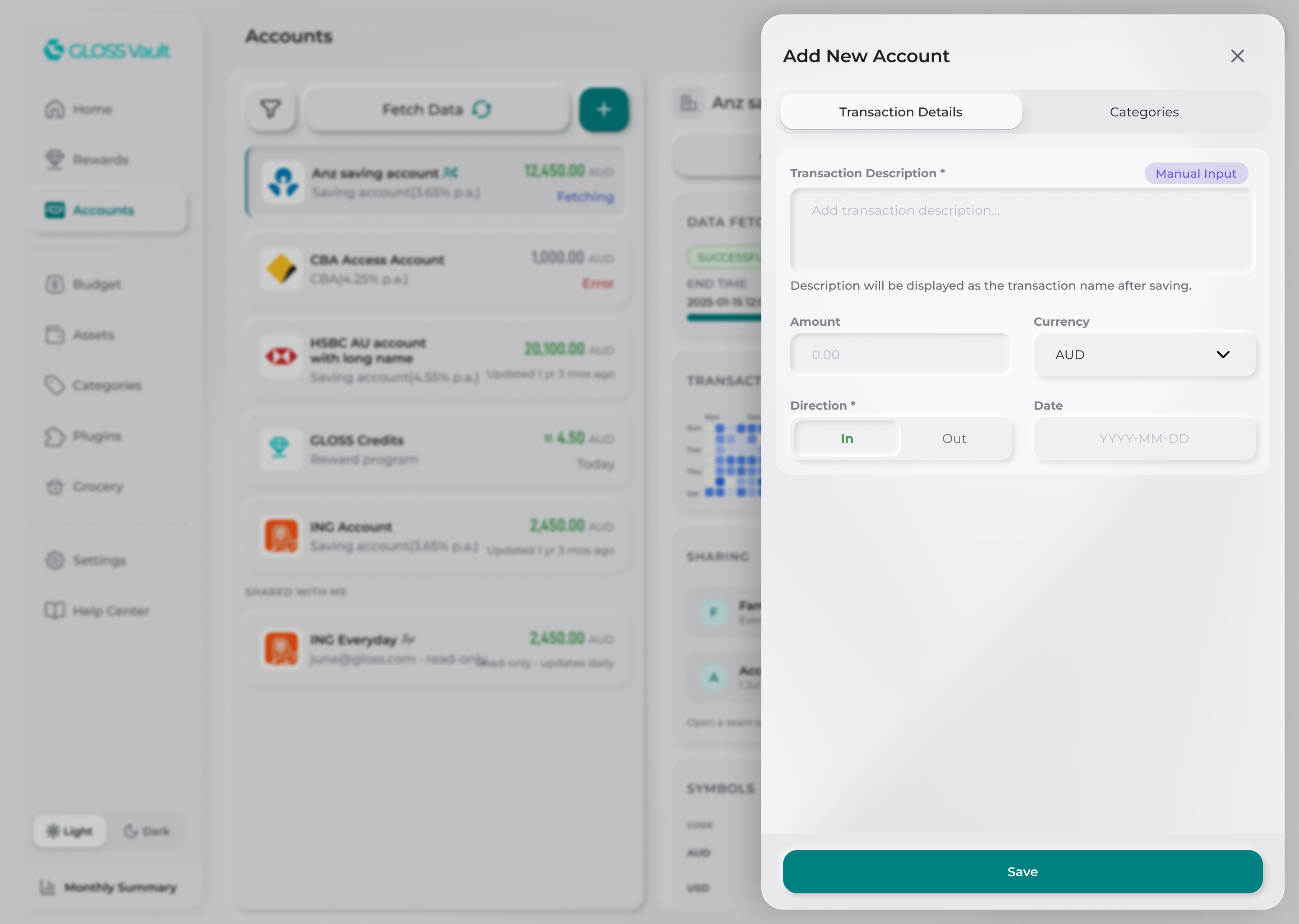
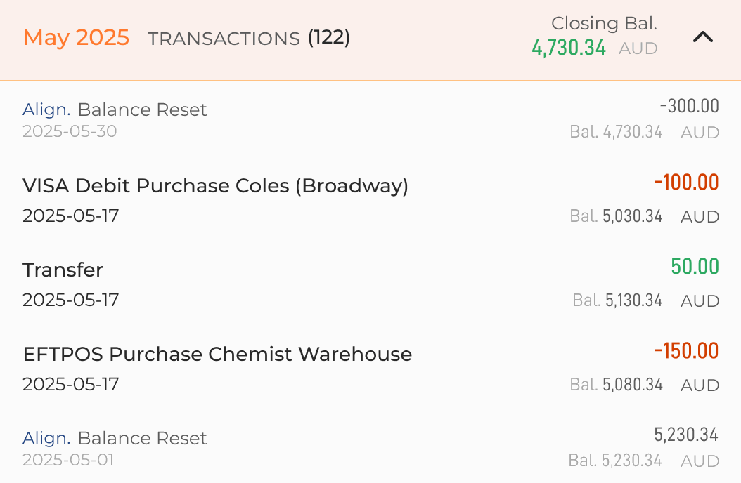
Transactions are entered one at a time and can be edited and categorised afterwards; an account can also keep an uploaded statement (PDF or spreadsheet) in its details for reference. When a balance goes in, GLOSS lines the running total up with it automatically and records the gap as an “Align” entry, which can be adjusted later. Going back keeps what you typed; cancelling clears it, but only after a confirmation.

Add account, step 3: adding the first transactions
3 · Add the first transactions by hand.
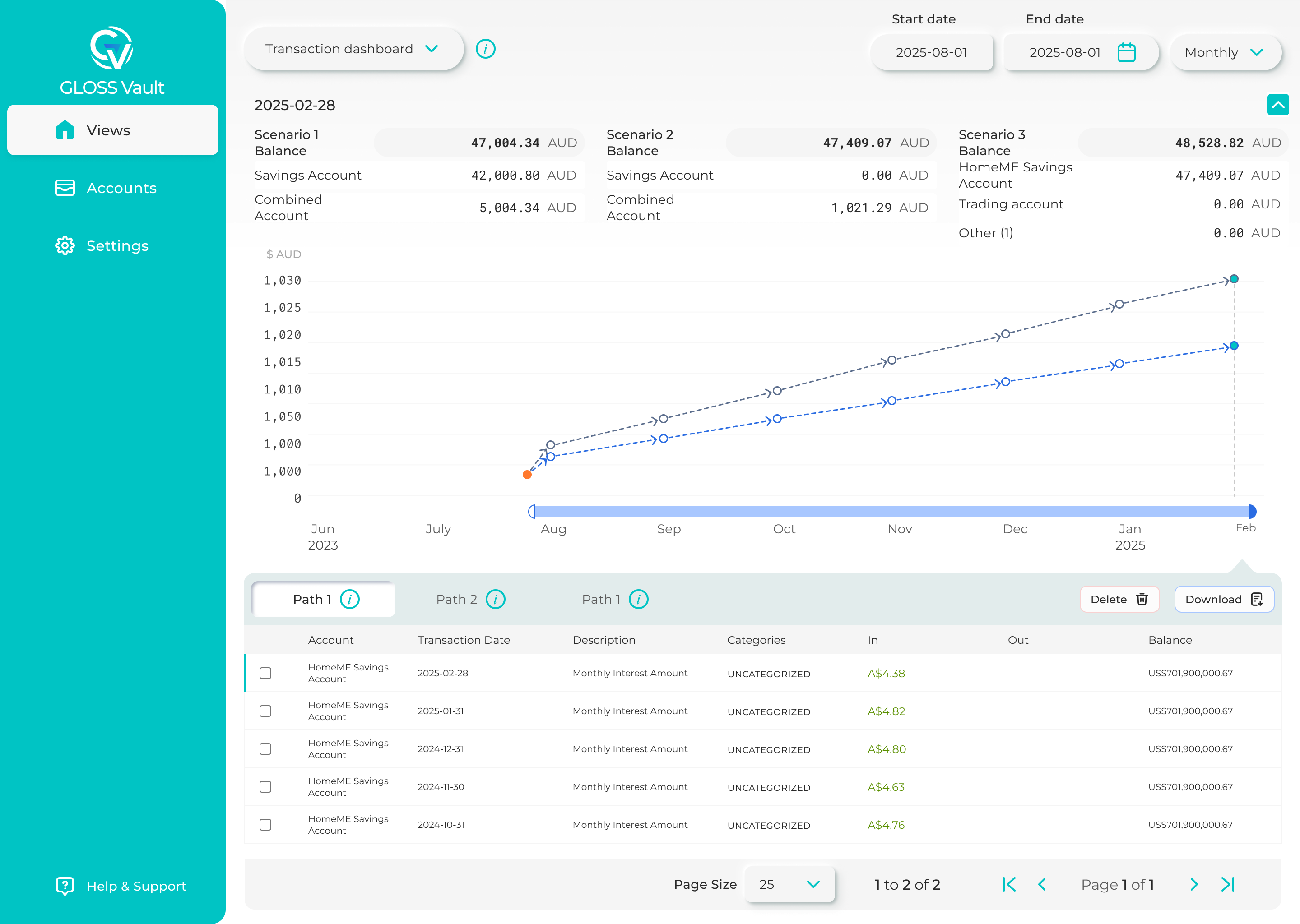
The Past view's transactions for May 2025: two Align · Balance Reset rows keep the running balance in line with the balance entered
Enter a balance and GLOSS lines the history up with it: the gap becomes an Align entry, open to adjustment.

First-run guide

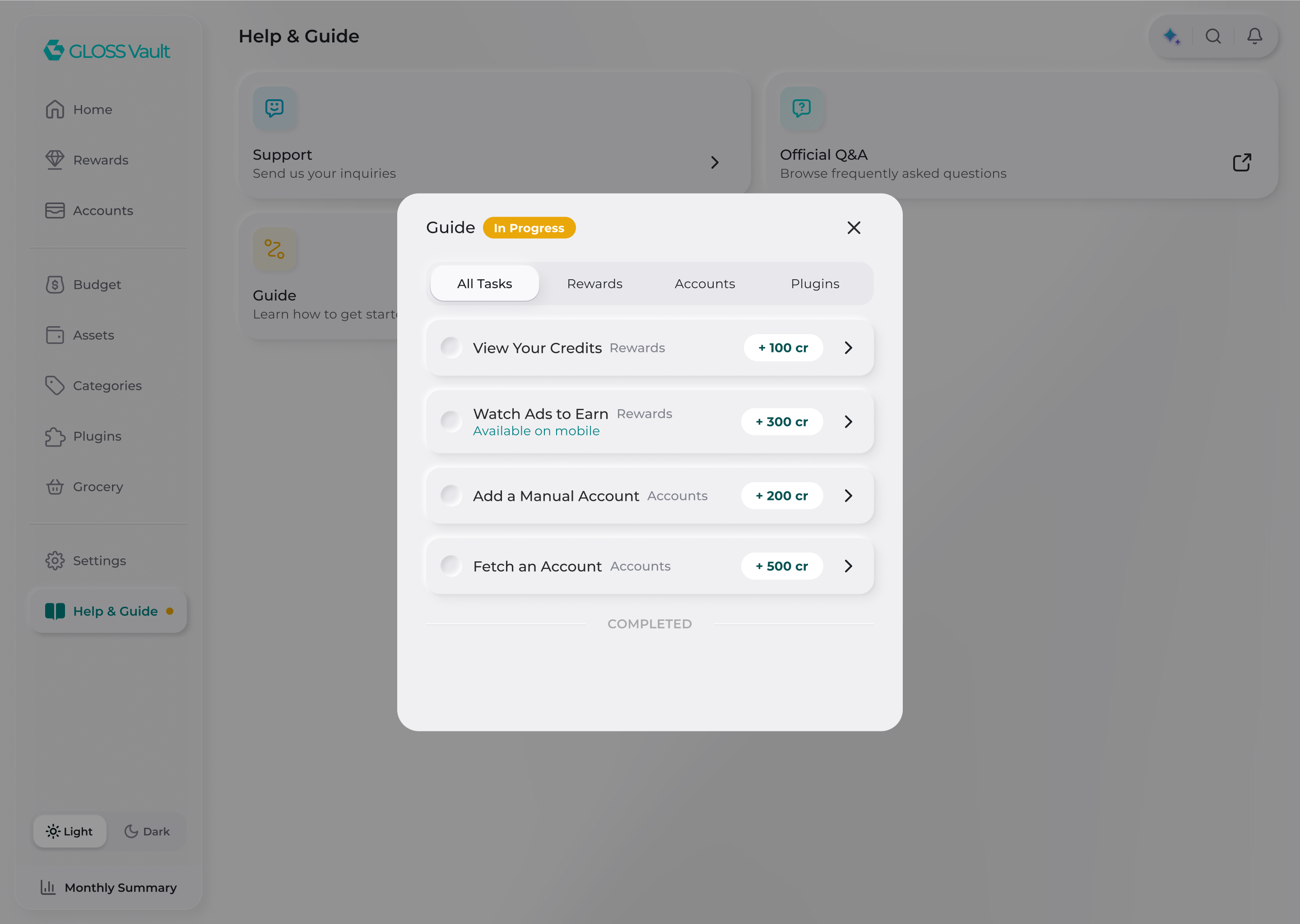
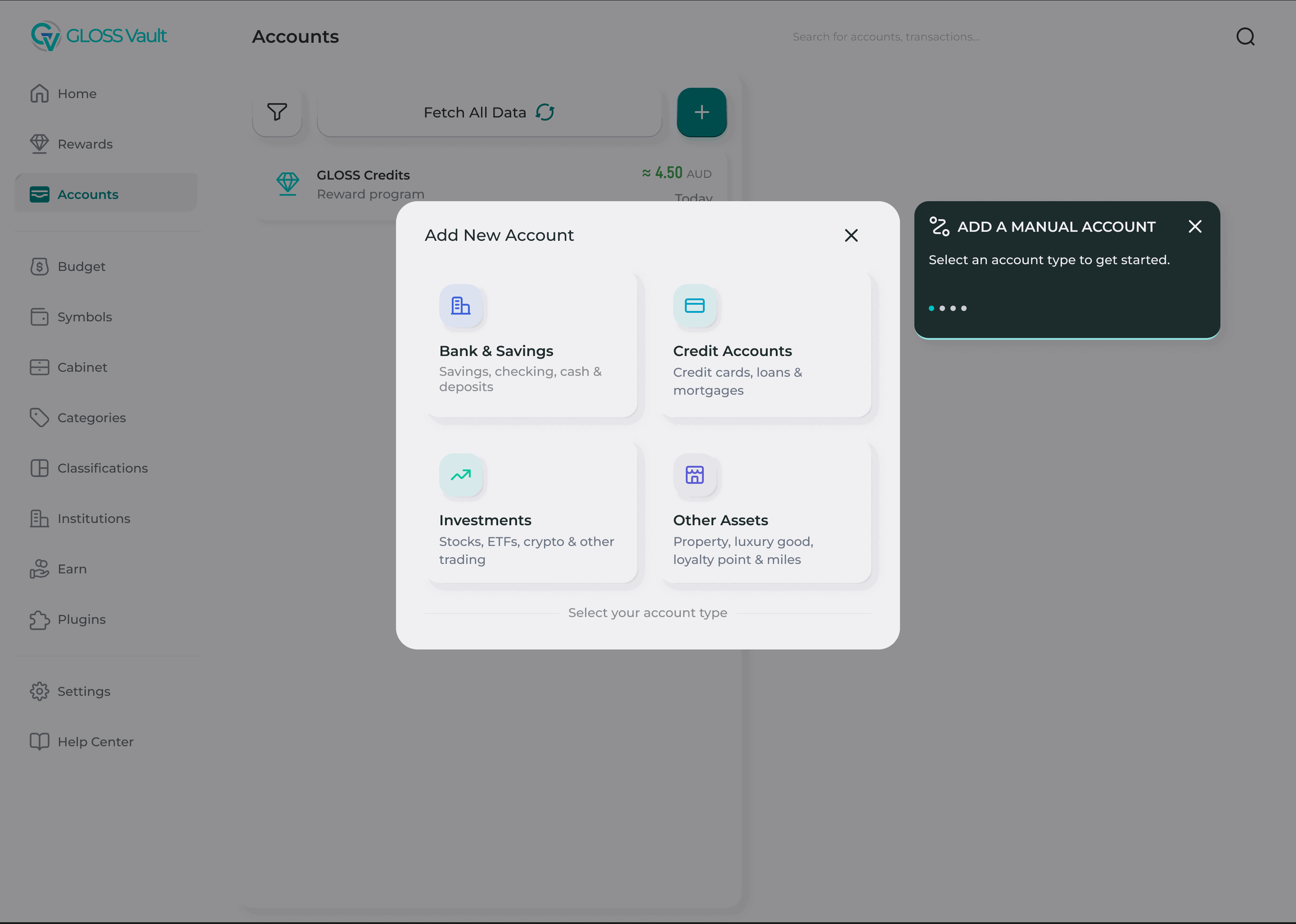
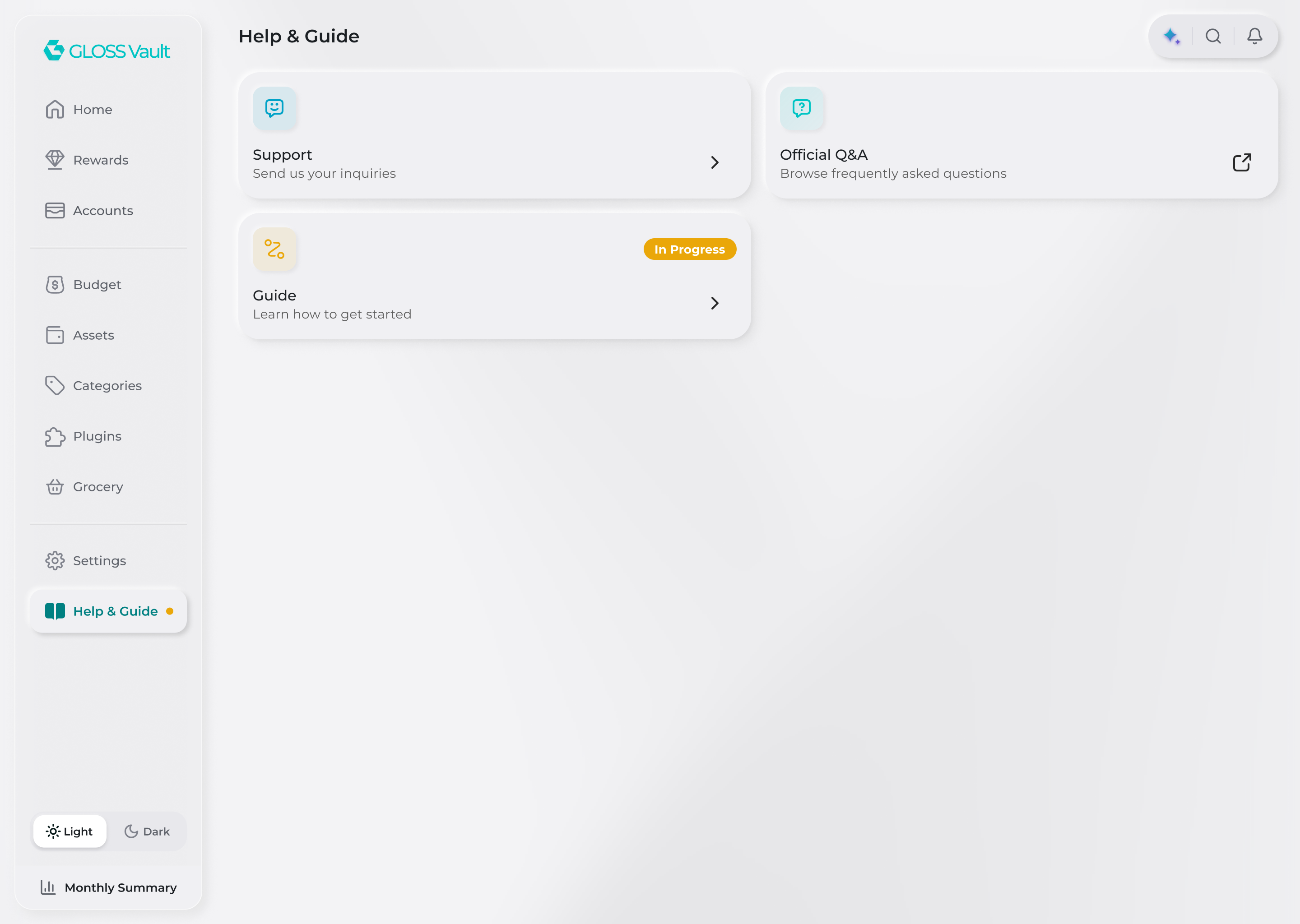
Setup can be interrupted, too. The first time through, a guide walks people through each task with coach marks and pays GLOSS Credits for finishing it; a yellow dot on Help & Guide brings them back to where they stopped. The dot belongs to that first run only. The guide can be replayed from Help & Guide at any time, but a replay doesn’t earn credits again.

The Help & Guide task panel: four setup tasks, each with the GLOSS Credits it pays
The first-run guide: a task list, each task worth GLOSS Credits.
A coach mark beside the Add New Account dialog: Add a manual account, select an account type to get started, step 1 of 4
Coach marks walk through each task, one step at a time.
A yellow dot on the Help & Guide item in the navigation
Stop half-way and a yellow dot on Help & Guide marks the spot.

02 · Design system

One hex, two jobs

Two years and three major revisions had left geological layers of style. When I audited the system in June 2026, a single Home screen was bound to variables from three generations of the library, typography still lived in legacy styles while colour lived in variables, and eight issues made the severity-ranked list.

Home screen in light mode
Light.
The same home screen in dark mode
Dark: the same screen, one variable mode apart.

The split

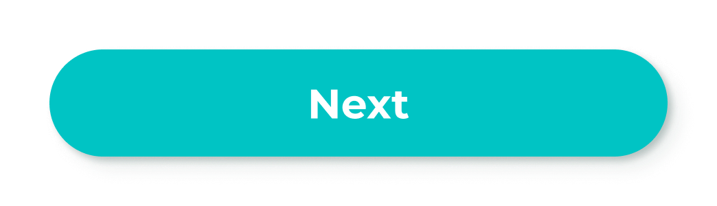
The decision I’m proudest of: GLOSS has three time views (Past, Today, Future), each with its own accent. Today’s accent was the brand teal, #00C4C4, and so was the primary button. One hex was doing two jobs. Inside the Today view nobody could say which one a button was following, and white text on #00C4C4 is 2.17:1, which fails WCAG AA anyway.

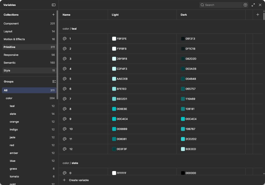
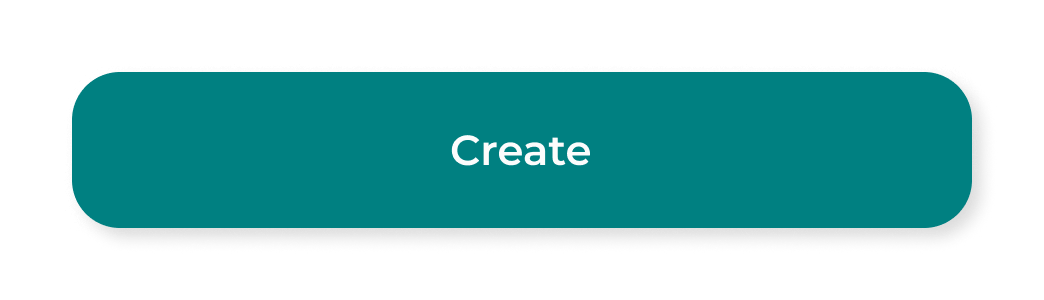
I split it into two roles. The Today accent stays #00C4C4 in both themes and is only used for tabs, charts, selection and focus. The action colour became its own token: #008081 in light (4.77:1 with a white label), #2CD2D2 in dark (10.1:1 with a dark label). Buttons stopped changing identity when you switched tabs.

The Figma variables panel of the design system: collections on the left, the colour primitives with a Light and a Dark column
Figma variables: the light / dark switch lives only in the primitives.

Before

#00C4C4 was both the Today accent and the primary action.

The old Next button: a white label on #00C4C4White label on it: 2.17:1. Fails AA.

After

accent/today stays #00C4C4. action/primary is its own token.

The new Create button: a white label on #008081#008081 light, 4.77:1 · #2CD2D2 dark, 10.1:1
The component

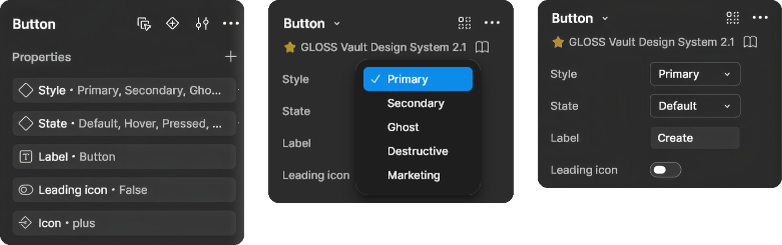
That split could reach every screen because Button is one component. I rebuilt it with properties: five styles, Destructive for deletes among them, and four states, Disabled among them: twenty variants in all, plus a text label and an optional leading icon. Primary’s fill reads button/primary/bg, which points at action/primary, so changing the role changes every Primary button at once. The old Next button, for comparison, was painted straight from the primitive Teal-500.

Three Figma panels of the Button component: its properties (Style, State, Label, Leading icon, Icon), the Style picker (Primary, Secondary, Ghost, Destructive, Marketing), and an instance set to Primary, Default, label Create
Button in the 2.1 library: five styles and four states, a label and an optional leading icon. Right: the sheet’s Create button is one instance of it.

Rule

Components reference semantic tokens, never a raw primitive.

Button’s Primary fill is button/primary/bg → action/primary. The old Next button read Teal-500 directly.

Handoff

Engineering gets a versioned package, not a Figma link: token JSON, compiled CSS, a changelog with migration notes, and an interactive docs site. I built the pipeline with AI tooling; the audit, the rules and every decision in it are mine.

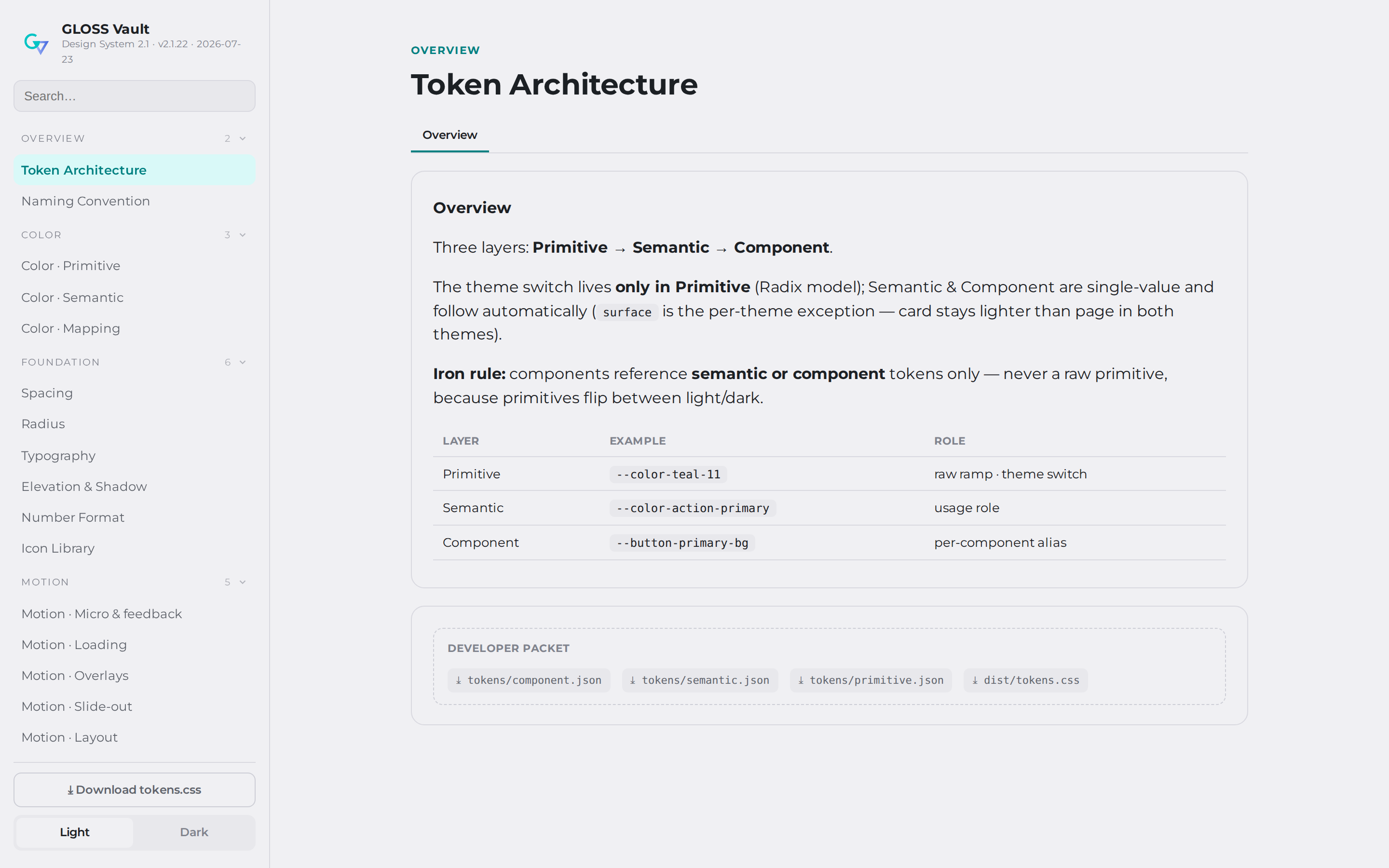
The design-system docs site: the token architecture page, with the navigation of every foundation and component
Docs site: primitive → semantic → component.
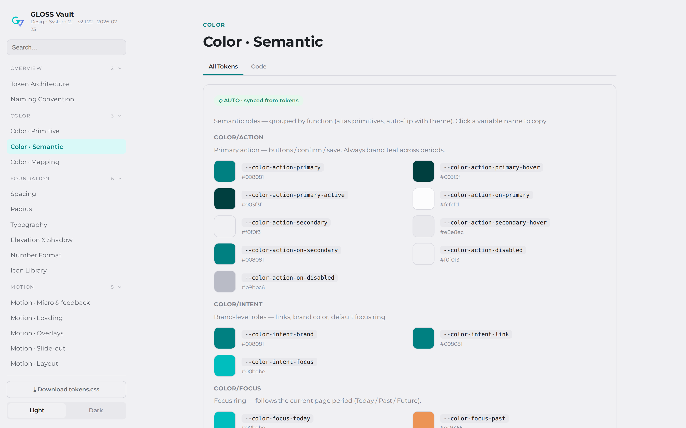
The design-system docs site: semantic colour roles
Docs site: semantic colour roles, previewed live.

Tokens

846 tokens in three layers

305 primitive · 242 semantic · 299 component

Releases

Released most weeks, as design needs come in

46 versions since June (2.1.0 → 3.15.1), each with a changelog entry
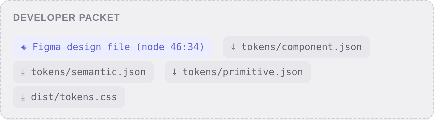
The developer packet at the foot of the Button page in the docs site: links to the Figma node, tokens/component.json, semantic.json, primitive.json and dist/tokens.css
Every docs page ends in a developer packet: its Figma node, the token JSON and the compiled CSS.

02 · Design system · Dark mode

Dark mode is not an inversion

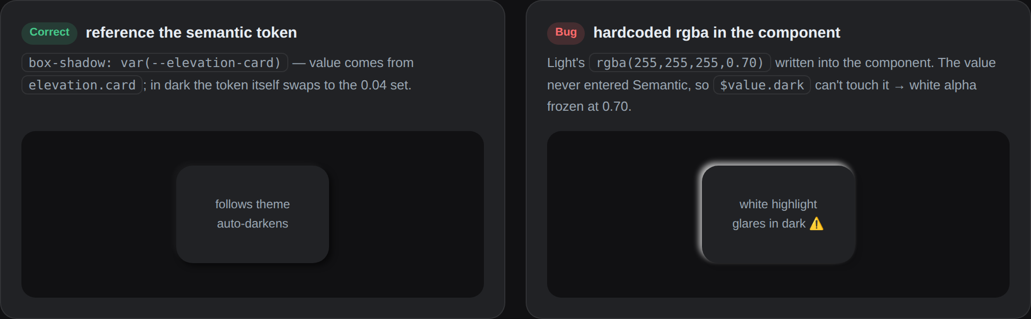
Colours flip through the token layers: a semantic role like surface/page re-points from one grey step to another, and the primitives themselves get darker. Shadows can’t work that way. GLOSS surfaces are neumorphic, a white highlight top-left and a black drop bottom-right, and the highlight that reads as depth on a light page glares on a dark one.

Two identical cards in dark mode: the left one reads the elevation token and its shadow darkens with the theme; the right one hardcodes the light shadow and its white highlight glares
Dark mode, same card twice: left reads the elevation token and darkens with the theme; right hardcodes the light shadow and its highlight glares.

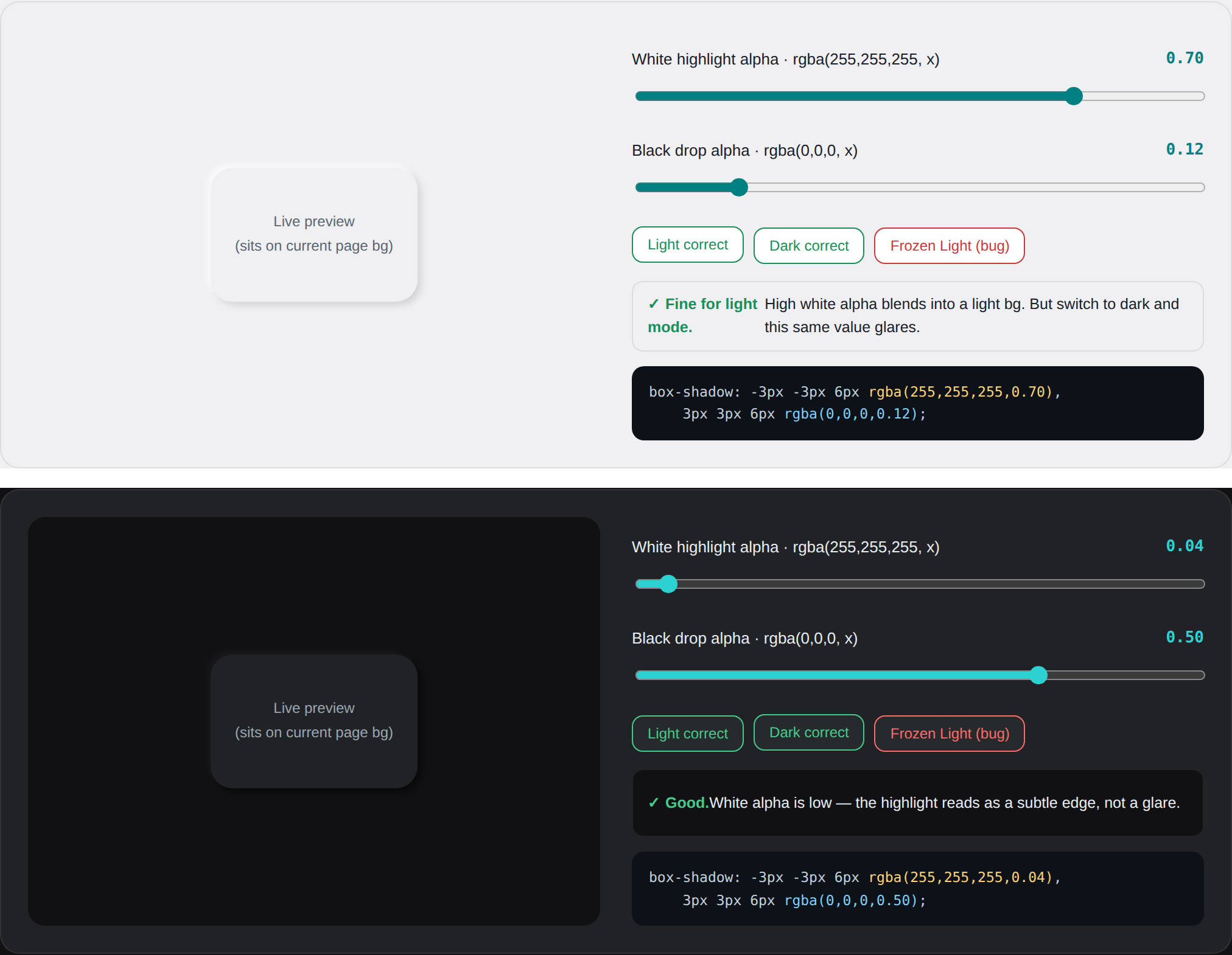
So elevation tokens carry their own light and dark values instead of pointing at a primitive: in dark, the white highlight falls from about 70% to under 5% and the black drop deepens from about 12% to around 50%. In Figma the same rule is an eight-step shadow colour scale held in mode-aware variables, so no effect style carries a raw colour and the two themes stay in step. Modal shadows are the deliberate exception, a plain downward drop with no highlight, because a dialog floats on a dimmed scrim. A third, flat set covers low-end Android WebViews and reduced-transparency settings.

The interactive shadow lab from the handoff docs, in light mode above and dark mode below
The interactive lab from the handoff docs: drag the alpha and break it yourself.

Colour

Two layers do the dark work: the semantic role re-points, the primitive changes its hex.

Shadow

One layer only. The elevation token holds light, dark and flat in itself.

Dark rule: white highlight ≤ 5%, barely visible by design · black drop 45–60%

02 · Design system · The file

The file has a front door

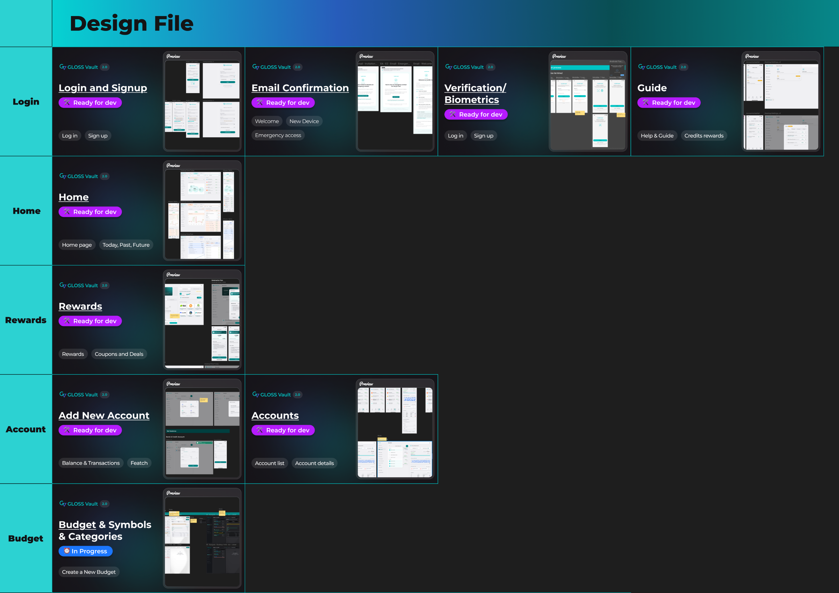
The design file is designed too. It opens on an index board: one card per module, carrying a preview, the sub-flows inside it, a status pill (in progress or ready for dev) and a title that links straight to that module’s page. The cards follow the app’s navigation, reordered as features are updated. The PM and the engineers find the current screen without asking me for a walkthrough, and anything still in progress is visible from the front door rather than buried somewhere down the page list.

The index board of the GLOSS design file: a row per module (Login, Home, Rewards, Account, Budget), each card with a preview, its sub-flows and a status pill (Ready for dev or In progress)
The index board. Every card title is a link into that module’s page.

Front door

One card per module: preview, sub-flows, status pill, and a link to the page.

Why

A long page list is not a handoff. An index is.

The index is my own system for running the file: built for the PM and the engineers, not for me, and how they find earlier designs too.

03 · Product judgement

The things nobody asked for

Product thinking at an early-stage company mostly looks like noticing problems before they’re tickets.

The old home screen: a table of balances
Before: the home screen read like a spreadsheet export.
The new home screen: a bubble chart of assets by category
After: a bubble chart of assets by category. Nobody had asked for it; I proposed it.
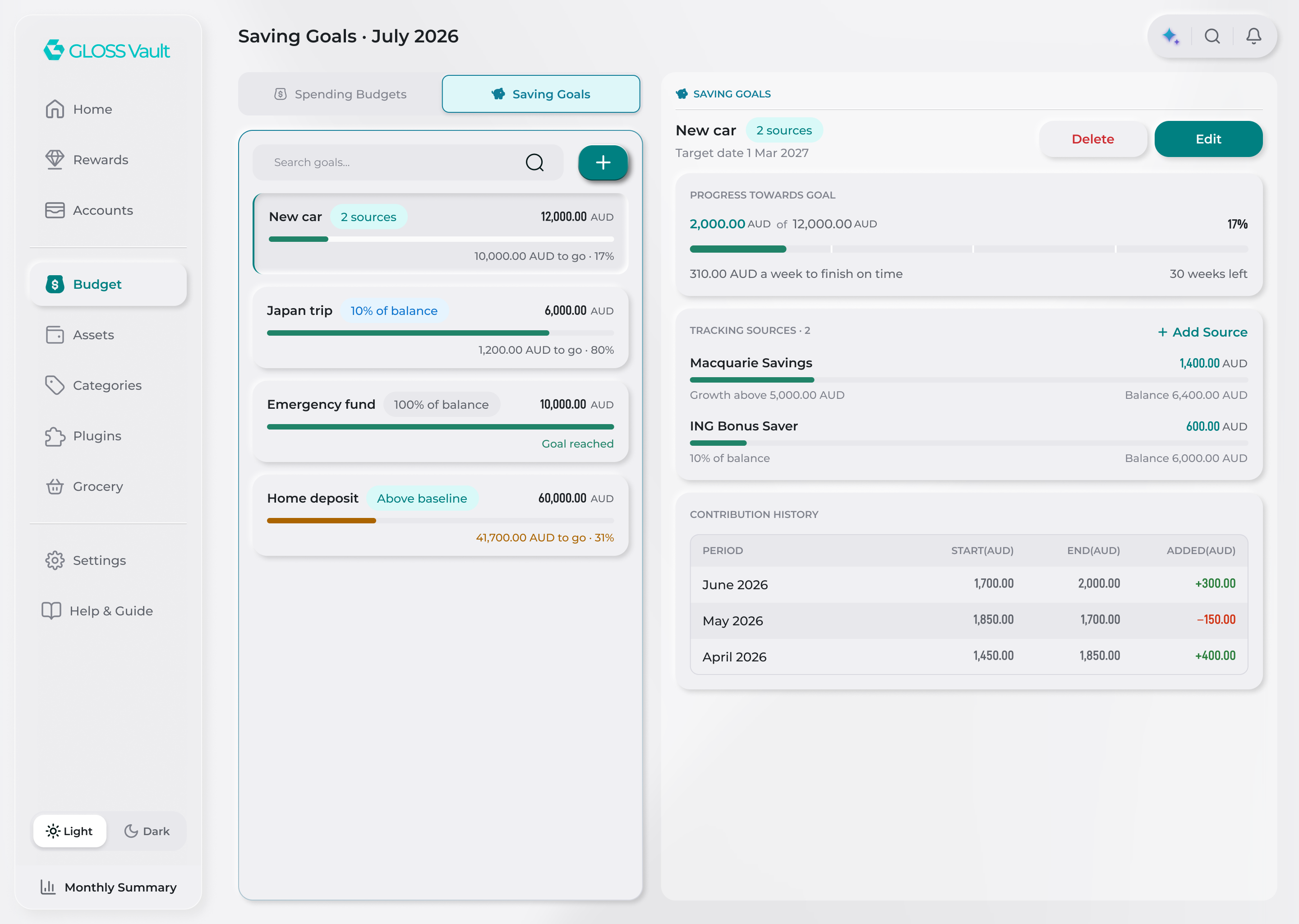
The Budgets page with saving goals selected
Saving goals vs spending budgets: you pick the type first, and “add” sits one level below the toggle, so it always belongs to the type you’re looking at.

“Add a column, the wide screen looks empty.”

It wasn’t a content problem. It was a responsive-layout problem: centring the content fixed it with no new feature.

Saying no

Summary widgets in Budgets would have repeated what the Transactions view already shows, so I argued against them.

04 · Impact & reflection

What I can point to, and what I’d do differently

GLOSS is early-stage and I don’t own measurement: the PM works closest to users and defines what each feature needs to do; my part is the interaction and the flow. So I can’t lean on numbers, and I’d rather say that than invent one. What I can point to: every feature above shipped, on desktop and mobile, in light and dark.

I started with Figma styles because the team was small and styles seemed like enough. Dark mode proved otherwise: styles solve consistency, variables solve systems. From 2.0 through today’s 2.1 the system has run on tokens and Figma variables, and that is what made dark mode practical to roll out. Next time I’d start on variables from the first version.